
First Look: Windows 7 Beta Performance
Manufacturer: MicrosoftWithout a doubt, the bit-tech office is dominated by heavy Windows users; in fact, saying that we're "intimate with Vista" would be a more appropriate term if it didn't conjure images of cuddling up to a fat girl while we still think of our slender ex.
Windows Vista, for all its negative press, has a few advantages over Windows XP - it has a proper 64-bit version of its OS, better driver support for newer hardware that we spend our lives looking at, and it has DirectX 10 for improved graphics in games. Those three things alone seal the deal for us and it's why we constantly recommend it in our monthly buyer's guides. However, in the inevitable march of progress, the next generation Windows 7 will be knocking on our doors later this year or early in 2010.
After donning our usual "cynical" hats, we installed the latest public beta of Windows 7 to see what is new, whether it's worth getting excited about, and if there are any potential performance improvements already. Bear in mind though that this is a beta with very early drivers and it's why we've tagged the article a "First Look" - that is exactly what it is, after all.
What's New In #7?
I actually can't remember the last time a Windows OS came along that I've wanted to upgrade to. Maybe Windows 2000 was the last time, but that's because I couldn't wait to jump onto the NT kernel after having suffered through the days of Windows 9x for most of my computing youth. Within ten minutes of playing with Windows 7, three of us were already looking forward to the upgrade. It has basically fixed Vista.Yes, it's still shiny and a bit fluffy so those of you who classify yourself as 'old school' and are still using the classic theme will undoubtedly still hate it. However, instead of being a frustrating experience because things have been changed for the sake of change, Windows 7 corrects most of the rubbish that we have had to put up with in the transition to Vista.
Here's a run down of most of the major changes that will affect our readers:
- Customisable User Account Control interference now goes in four stages from the basic "You're on your own" to "Did you want to move the mouse?"
- Better start button search the splits the results between programs, the control panel (if applicable), documents and files.
- Better networking support with it easier to find network settings - particularly the network adapters which are now not buried under 20 feet of sub directories. In addition there is cleverer network printing support - Windows 7 knows which printer is on which network, and then recognises and reassigns the default printer according to the connection it detects. Basically, it takes out the stress of remembering to flick between your home printer and the one at work.
- More obvious sharing options that are easier to find, but unfortunately, still no easier to use.
- No more sidebar - instead we have completely free-roaming Gadgets.
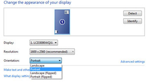
- Better multi-monitor, portrait/landscape support and improved resolution options.
- Document Libraries - Instead of forcing all your documents into one place, which may not be how you like to do things (I know my own "My Music" folder on C:\ certainly doesn't house my music - that goes on my RAIDed NAS box) , instead folders or even locations/shares can be tagged to a library, regardless of where they are hidden.
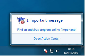
- Windows Action Centre and Solution Centre - It's the new Security Centre, but less intimidating with more "Action" and "Solutions" instead of big red or yellow bars across the screen. Rolled into this is system maintenance, backup and recovery and performance settings. This has also allowed Microsoft to hide all the pop-ups usually associated with the system tray in the Solution Centre, enabling the user to deal with all of them in one go and helping to keep the desktop cleaner.
- Snapping Windows - basically a single widescreen monitor, which many of us now own, isn't much use for reading long webpages or writing documents. Now by dragging the open window to the side of the screen it can be snapped to use 50 percent of the screen real estate. Drag a window to the top of the screen and it's fully maximised, click and drag it down and it's restored to its original size. It works really very well because it's such a simple gesture, but it makes you think - why has this taken nearly 20 years?
- New Paint - Well, it's a long overdue overhaul of Paint dragged kicking and screaming into the 21st century. It now has an Office 2007 style ribbon and lots of
oldnew basic features we've had in Photoshop for quite a while: crop, proper rulers, proper brush styles and pre-rendered shapes.


MSI MPG Velox 100R Chassis Review
October 14 2021 | 15:04



Want to comment? Please log in.