Mount & Blade: Warband Review
Publisher: Paradox InteractivePlatform: PC Exclusive
UK Price (as reviewed): £24.99 (incl. VAT)
US Price (as reviewed): $29.99 (excl. Tax)
Open-world medieval sim Mount & Blade was, I think even the hardcore aficionados will admit, not a very easy game to like. It was ugly. It was unwieldy. The user interface looked about as nice as a crab with a lecherous wink and it probably took at least three or four hours before anyone mastered the art of hitting things from horseback.
In that way, standalone expansion Mount & Blade: Warband is no different.
One other undeniable truth about the original Mount & Blade though was that, once you had spent the time to learn how it worked, the sense of reward you got from actually surviving it made most other games go pale in ashamed comparison. Actually getting the timing and aim right so that you could shoot a charging rider off his stallion with a single arrow offered a sense of giddiness that’s hard to top.
And in that way too, Mount & Blade: Warband is no different.
Therein lays one of Warband’s biggest flaws though; that it might not offer long-time fans a different enough experience from the original and that, while there are plenty of improvements, many of them haven’t been pulled off with the level of polish you might have hoped for. It’s better, but not as good as it could and should be, in other words.
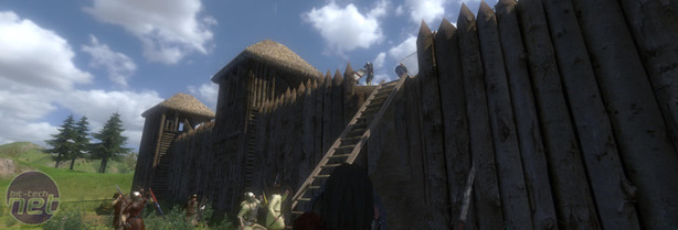
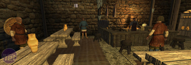
The actual aesthetic is an excellent example of this as, for all Warband’s talk of improved visuals, the game still appears incredibly basic by almost any standard. It’s not so much in the look per se, as the textures are now more or less up to par, but more in the way it moves. The models are still rudimentary at best; animations slower than a slug trying to climb out of a greasy bin bag.
And yet, as seems to be a recurring theme for Warband, there are exceptions to the rule. HDR has been added in for example and, while in most games that’s not exactly something to get excited about unless you have an unusual fetish for simulated momentary blindness, Warband manages to make it an actual part of the gameplay. Castle sieges, which make up one of Warband’s new multiplayer modes, can be won or lost by the placement of archers on the parapet because wily warriors will stand with the sun directly behind them. All assaulting forces will see is a volley of arrows spewing out of the sky; they’ll be unable to draw mark on defenders.
What makes this thoughtful addition all the more notable though is simply the fact that this cleverness isn’t consistent through out the game. The interface – the part of the original Mount & Blade that was most in need of an overhaul and usually the most important part of any game – has been left to languish, boxy and shoddily spaced. It looks like something designed by in MS Paint by someone who’s only knowledge of the game came from having it described to them in a different language. It destroys the sense of immersion and craft which is otherwise mostly consistent.
Quite simply, the fact that Taleworlds hasn’t bothered to try and improve the UI in any meaningful way spoils an awful lot of Warband’s appeal. Whether you’re trying to accept a quest in singleplayer or trying to remove a helmet from your loadout in multiplayer, you’re usually still left feeling like you’re banging your head against a wall. For which, ironically, a helmet is advised.

MSI MPG Velox 100R Chassis Review
October 14 2021 | 15:04


Want to comment? Please log in.