If you're hoping that Windows 7 will be a step in the right direction for Microsoft, you might want to cast your eyes over some details revealed at the Microsoft Professional Developer's Conference.
Ars Technica's coverage includes confirmation from Microsoft that Windows 7 will be based on the core work carried out for Vista, with no major changes to the underlying architecture of the OS. Instead, Microsoft is concentrating on improving the user experience via an enhanced UI which carries on the work done in Vista's Aero.
The first thing to notice is that the taskbar has undergone a complete revamp, now appearing to take its design cues from Apple's Dock – gone are the text labels of old, replaced with big shiny icons in their stead. Hovering over an icon will present thumbnails of each window that application has open; click on a thumbnail and you're taken to the relevant window.
Right-click on an icon and you'll get a feature new to Windows 7: the 'jump list', which allows an application that hooks into the provided API to bring up a menu containing recent documents and common tasks for rapid access. Interestingly, the jump lists have been designed with a touch interface in mind: when used with such a device, the lists are larger to make accurate selection easier.
The functionality of Aero has been extended, too: as well as providing eye candy, the 'glass' effect has been used to provide a 'peek' function. Simply mouse over a thumbnail on the taskbar and all currently open windows except the one you select will turn transparent, allowing you to see information contained in an application without actually having to change focus. Handy, although it's something other operating systems have had for a while now.
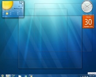
Neowin has mentioned that the sidebar introduced with Vista has vanished from sight. Gadget fans needn't worry, however: rather than having a large floating bar taking up precious screen real-estate, Windows 7 will allow gadgets to integrate directly with the Windows desktop – which, to be honest, is where they should have been in the first place. While anyone enjoying the benefits of a 22”+ high-resolution monitor probably won't care all that much, if you're using an ultra-portable laptop you'll be only too aware that every pixel counts – making this possibly one of the most useful changes so far.
Another change to the UI is improved window snapping: bring a window alongside another and it will automagically 'snap' to the right place, making tiling multiple windows together much easier. Drag a window to the top of the screen, and it will automatically be maximised.
The system tray has had a revamp as well. While XP introduced the ability to hide system tray icons, Windows 7 will make that the default. Any new icon inserted into the system tray by an application will be hidden unless the user chooses to have it displayed. A smart move, and one which again shows the desire to maximise usable screen area without impacting the eye candy too severely.
Additional features demonstrated within Windows 7 include a simplified home networking system with centralised search capabilities called Home Group, 'libraries' that allow easier organising of media and simple sharing between PCs, and improved accessibility options including an enhanced magnifier application.
Music fans will be pleased to hear that Windows Media Player can now be controlled directly from the task bar, and even more astounded to hear that the ability to control UPnP media devices across the network has been added under the name Play To: simply pick a song (or picture, or video) and a device on your network and Windows will start playing the music through said device. Especially handy if you've got a laptop with a large collection of music and a SoundBridge or similar hooked up to an amplifier.
The last feature that deserves special mention is the 'Device Stage'. Built into the new version of Windows Explorer, the system searches an external device for a specially crafted XML file containing information and product definitions. When loaded, this will allow Explorer to display a picture of the particular device you're exploring along with device-specific tasks and status information.
If you're still interested in learning more about the changes due in Windows 7, PC Pro has a near-exhaustive list of content from PDC for you to peruse. If that still isn't enough, the official PDC website has a range of video content for you to drool over while you wait for the official launch. Sadly, there's still no sign of a public beta; while PDC attendees snagged a closed copy of the code, it was sadly an earlier version than was previewed and as such was missing many of the features referred to in this article. Whoops.
Do you think Windows 7 might be worth the upgrade from Vista, or could it even be enough to tempt the stalwart XP holdouts into a new OS? Share your thoughts over in the forums.

MSI MPG Velox 100R Chassis Review
October 14 2021 | 15:04


Want to comment? Please log in.