A Week With Windows 8
April 28, 2013 | 16:26
Windows 7 was largely well received from the moment it was released. It looked and felt a lot like XP and Vista, but with some noticeable and useful tweaks including everything from Snap (aligning two windows side by side in a matter of seconds) to Snipping tool and decent SSD support. It’s little wonder, then, that Windows 7 sold very well indeed.
With Windows 8, however, Microsoft has made the most significant visible changes to the OS that we’ve seen in over a decade, and most reviews have been far less glowing. So when ordering my new laptop the plan was to install Windows 7 on it as soon as it arrived. But, not one to blindly take other people's word for it, when the laptop did arrive I thought I’d relent on my original plan and actually give Windows 8 a go for a week. Here’s how I got on. [break]
As usual with new laptops, the OS is pre-installed so all you have to do is type in the usual blurb such as account name and WiFi password and away you go. Except it wasn’t quite that simple with Windows 8. With Windows 7, you can skip various steps such as Windows update settings and the like and just get to the desktop – useful if you know what you’re doing.
Windows 8 demanded that I jump through numerous hoops first, including entering my Hotmail account username and password, before it let me log on. Then, having set my preferred background colour, it decided to cycle through the full spectrum of other colours whilst completing the install. Pretty, but wholly unnecessary.
Eventually I landed at the infamous Metro UI. Now until this point I’d deliberately avoided Windows 8 systems I came across as I wanted to wait and see for myself what the OS was like during more than a fleeting glance. The first thing that struck me were the different sized icons – it just made for a cluttered look at the start and tiles as opposed to icons did take some getting used to. I set about re-arranging these and continued to do so till I’d cleared the way to begin installing my own applications.
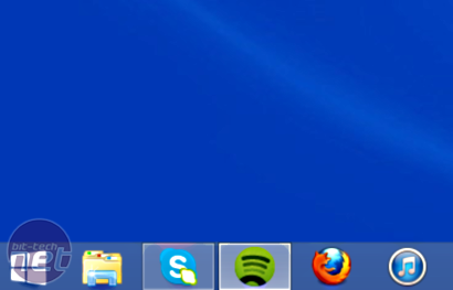
The second thing that struck me is how often I found myself flitting between Metro and the desktop. Whenever you open a standard application, you’re transferred to the desktop, which, for a PC or non-touch-screen laptop owner seems like a waste of time to me. That's beside the issue that I ended up with apparently two different installations of Skype - one being the integrated Modern UI app, the other which I'd installed automatically using Ninite, which I reach for every time I deal with a fresh OS install.
Despite signing in on the desktop app version, my details hadn't been synced with the Modern UI one. Bizarre. Another little issue that absolutely infuriated me at first was that Windows 8’s swipe and other touch gestures were automatically assigned to my laptop’s touchpad.
I’ve never sworn at an operating system before but every flick of the pad seemed to tab me away from what I was doing to land at Metro or on another application. Eventually I disabled all gestures in the laptop’s touchpad control centre, although I did try the pinch to zoom function, which turned out to be a jerky mess compared to tablets and smartphones I’ve used, so that got canned too.
Using the Mail application from Metro was also a pain in the rear. It seemed overly-simplified to me, and it was a nightmare opening attachments. While I was out, I needed to view an attachment and then get back to the email while on a call with a courier company. It took far longer to fiddle around in Metro than it would have done on the desktop, with the main issue being it wasn’t obvious where files, attachments and such like were being opened and how to get at them.
Something I loved about Windows 7 was the enhanced search. I was initially stumped in Windows 8 but eventually found that instead of clicking in a search box, simply typing in Metro starts the search automatically. This is all well and good, but I still prefer clicking on icons, especially those pinned to the taskbar, to open regularly-used programs - okay maybe that's just a personal preference thing.
Then there’s the issue of shutting down or restarting. It’s probably the simplest but most utterly ridiculous issue in Windows 8. I prefer shutting my PC down because it means I can turn off hibernation and save a shedload of disk space on my SSD. Other people do it to save money on their electricity bills, so to add several layers of menus and the condescending-sounding Charm Bar to get at the power options was a serious no no. On a tablet you have the option of hitting the power button to be given an instant option to power down, but not so here.
Microsoft seems to have forgotten that for PC users, the PC power button is usually located under a desk, or two feet above it meaning it’s far more convenient to use the Start Button.
Having ironed out the more pressing issues I found with Windows 8, Metro is slowly growing on me but something I stand by is the fact that many tasks seem to take longer due to the constant switching between metro and the desktop, and multitasking in particular just seems frustrating in Metro, at least for newcomers.
You open an email attachment, but once you minimise the window, there’s nothing obvious about where to look to view it again. The Mail application was so laggy, that I often didn’t bother waiting to see whether a file type was a PDF or something else before trying to open it, and I often found myself clicking back into Mail to find it again. In contrast, on the desktop, Adobe Reader or Windows Photo Viewer would have popped up and would be sitting on the taskbar.
There are of course numerous tips and tricks out there to get the Start Menu back and a whole load of other things, but I’m loathe to do too much of this as it will mean having to do it every time I reinstall the OS, which I tend to do a few times a year to clear things out. However, one simple option that at least allows you to use the Desktop as you used to - along with booting into it and also retaining a customisable Start Button - is Start8. In short, it's probably the best $5 I've ever spent. Funnily enough, system builders are including Start8 with new systems, most likely due to tech support calls asking where the Star Menu has gone.
I may stick with it for the time being, especially as Start8 seems to have got me back to roughly Windows 7 status, and of course, the next version of Windows has unsurprisingly reintroduced the Start Button. However, seeing as Windows 8 doesn’t really offer anything useful over Windows 7, for me anyway, I can quite easily see me reverting back at some point in the next week or so, especially as I mainly use my laptop for Word processing, web browsing and the usual communication stuff.
It isn't all bad, though. I can see how its ergonomics would suit a touchscreen device, but I think Microsoft has forgotten that a vast majority of machines that will be using Windows 8 won’t have this feature. I can still achieve more in the same time with a monitor, mouse and keyboard than I can on a touchscreen, and Windows 8 seems to go against the grain here by leaning towards a touch-orientated interface. You only have to look at Google with search terms such as Windows 8 Metro to see just how many people have similar misgivings.
Have you used Windows 8? What were your impressions? Have you found ways around any features you didn’t like? Let us know in the forum.
With Windows 8, however, Microsoft has made the most significant visible changes to the OS that we’ve seen in over a decade, and most reviews have been far less glowing. So when ordering my new laptop the plan was to install Windows 7 on it as soon as it arrived. But, not one to blindly take other people's word for it, when the laptop did arrive I thought I’d relent on my original plan and actually give Windows 8 a go for a week. Here’s how I got on. [break]
As usual with new laptops, the OS is pre-installed so all you have to do is type in the usual blurb such as account name and WiFi password and away you go. Except it wasn’t quite that simple with Windows 8. With Windows 7, you can skip various steps such as Windows update settings and the like and just get to the desktop – useful if you know what you’re doing.
Windows 8 demanded that I jump through numerous hoops first, including entering my Hotmail account username and password, before it let me log on. Then, having set my preferred background colour, it decided to cycle through the full spectrum of other colours whilst completing the install. Pretty, but wholly unnecessary.

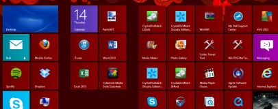
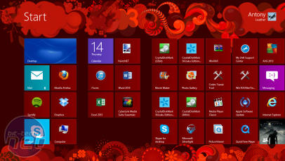
My Modern UI or 'Metro' screen after a few minutes of tinkering - it's alright but it's no desktop and taskbar. Click to enlarge
Eventually I landed at the infamous Metro UI. Now until this point I’d deliberately avoided Windows 8 systems I came across as I wanted to wait and see for myself what the OS was like during more than a fleeting glance. The first thing that struck me were the different sized icons – it just made for a cluttered look at the start and tiles as opposed to icons did take some getting used to. I set about re-arranging these and continued to do so till I’d cleared the way to begin installing my own applications.
The second thing that struck me is how often I found myself flitting between Metro and the desktop. Whenever you open a standard application, you’re transferred to the desktop, which, for a PC or non-touch-screen laptop owner seems like a waste of time to me. That's beside the issue that I ended up with apparently two different installations of Skype - one being the integrated Modern UI app, the other which I'd installed automatically using Ninite, which I reach for every time I deal with a fresh OS install.
Despite signing in on the desktop app version, my details hadn't been synced with the Modern UI one. Bizarre. Another little issue that absolutely infuriated me at first was that Windows 8’s swipe and other touch gestures were automatically assigned to my laptop’s touchpad.
I’ve never sworn at an operating system before but every flick of the pad seemed to tab me away from what I was doing to land at Metro or on another application. Eventually I disabled all gestures in the laptop’s touchpad control centre, although I did try the pinch to zoom function, which turned out to be a jerky mess compared to tablets and smartphones I’ve used, so that got canned too.
Using the Mail application from Metro was also a pain in the rear. It seemed overly-simplified to me, and it was a nightmare opening attachments. While I was out, I needed to view an attachment and then get back to the email while on a call with a courier company. It took far longer to fiddle around in Metro than it would have done on the desktop, with the main issue being it wasn’t obvious where files, attachments and such like were being opened and how to get at them.
Something I loved about Windows 7 was the enhanced search. I was initially stumped in Windows 8 but eventually found that instead of clicking in a search box, simply typing in Metro starts the search automatically. This is all well and good, but I still prefer clicking on icons, especially those pinned to the taskbar, to open regularly-used programs - okay maybe that's just a personal preference thing.
Then there’s the issue of shutting down or restarting. It’s probably the simplest but most utterly ridiculous issue in Windows 8. I prefer shutting my PC down because it means I can turn off hibernation and save a shedload of disk space on my SSD. Other people do it to save money on their electricity bills, so to add several layers of menus and the condescending-sounding Charm Bar to get at the power options was a serious no no. On a tablet you have the option of hitting the power button to be given an instant option to power down, but not so here.
Microsoft seems to have forgotten that for PC users, the PC power button is usually located under a desk, or two feet above it meaning it’s far more convenient to use the Start Button.
Having ironed out the more pressing issues I found with Windows 8, Metro is slowly growing on me but something I stand by is the fact that many tasks seem to take longer due to the constant switching between metro and the desktop, and multitasking in particular just seems frustrating in Metro, at least for newcomers.
You open an email attachment, but once you minimise the window, there’s nothing obvious about where to look to view it again. The Mail application was so laggy, that I often didn’t bother waiting to see whether a file type was a PDF or something else before trying to open it, and I often found myself clicking back into Mail to find it again. In contrast, on the desktop, Adobe Reader or Windows Photo Viewer would have popped up and would be sitting on the taskbar.

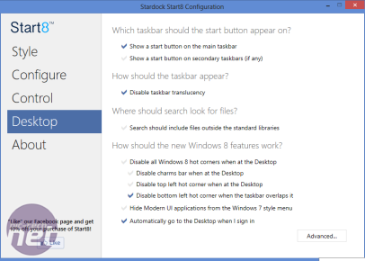
Start8 allows you to boot straight to the desktop instead of Modern UI and also reinstate the Start Button. Click to enlarge
There are of course numerous tips and tricks out there to get the Start Menu back and a whole load of other things, but I’m loathe to do too much of this as it will mean having to do it every time I reinstall the OS, which I tend to do a few times a year to clear things out. However, one simple option that at least allows you to use the Desktop as you used to - along with booting into it and also retaining a customisable Start Button - is Start8. In short, it's probably the best $5 I've ever spent. Funnily enough, system builders are including Start8 with new systems, most likely due to tech support calls asking where the Star Menu has gone.
I may stick with it for the time being, especially as Start8 seems to have got me back to roughly Windows 7 status, and of course, the next version of Windows has unsurprisingly reintroduced the Start Button. However, seeing as Windows 8 doesn’t really offer anything useful over Windows 7, for me anyway, I can quite easily see me reverting back at some point in the next week or so, especially as I mainly use my laptop for Word processing, web browsing and the usual communication stuff.
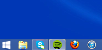
Start8's reinstated Start Button, complete with the normal shutdown options and search box. Click to enlarge
It isn't all bad, though. I can see how its ergonomics would suit a touchscreen device, but I think Microsoft has forgotten that a vast majority of machines that will be using Windows 8 won’t have this feature. I can still achieve more in the same time with a monitor, mouse and keyboard than I can on a touchscreen, and Windows 8 seems to go against the grain here by leaning towards a touch-orientated interface. You only have to look at Google with search terms such as Windows 8 Metro to see just how many people have similar misgivings.
Have you used Windows 8? What were your impressions? Have you found ways around any features you didn’t like? Let us know in the forum.


MSI MPG Velox 100R Chassis Review
October 14 2021 | 15:04

Want to comment? Please log in.