It has to be said, creating themed artwork for a game you have never played is never an easy task. There was the chilling trailer on WhatIsFEAR.com, and some 100-odd screenshots taken from early builds of the game, but finding the right balance required a little trial & error.
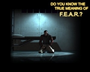
One of my favourites is this moody screenshot. I hope Photoshop purists will forgive my crappy font-work and see the intended imagery: the sole character, alone, with the encrouching shadows containing unknown nasties; I thought this embodied the concept of "fear" but Vivendi PR knocked it back, and back to the digital drawing board we went.
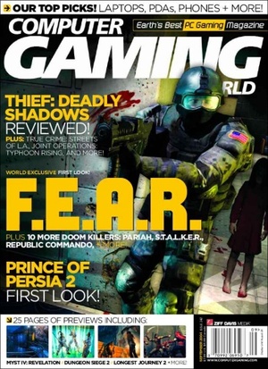
CaseSkins are printed at very high resolutions: 250dpi is the suggested minimum, and we were aiming to work at 300dpi. As a result, you sometimes gravitate towards a certain design based purely on the availability (or lack thereof) of suitably high-resolution artwork. Vivendi provided the source file for this cover of CGW magazine, weighing in at 40Mb and some 3425 x 5624 pixels!
However, as I alluded to, the design wasn't really flowing, and this guy was our only high-res artwork; even the largest screenshots were 'only' 1600x1200, and would look terribly blocky when scaled up to the required size.
With the deadline looming, it seemed that we were going to have to settle for less-than-ideal, when in rode a shining knight in the form of PCZONE magazine.
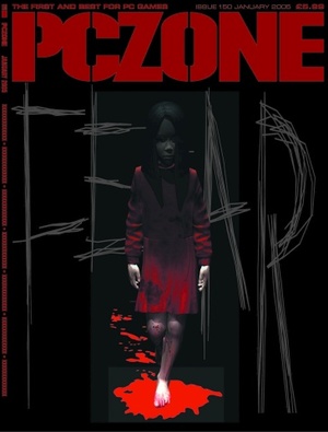
By a stroke of luck, the latest issue of the UK's top PC gaming magazine featured a big preview of F.E.A.R. and Vivendi's UK office had put together some custom artwork for the cover. VUG Australia agreed that it was perfect, and the insane-o-res file was quickly sourced and downloaded.
The design features the mysterious and creepy little girl character seen in several screenshots, and the word FEAR looks like it has been scratched in desperation using bare fingernails. The bloody footprints tell you that this chick is certainly no Girl Guide and the darkness of the whole thing is perfect.

One of my favourites is this moody screenshot. I hope Photoshop purists will forgive my crappy font-work and see the intended imagery: the sole character, alone, with the encrouching shadows containing unknown nasties; I thought this embodied the concept of "fear" but Vivendi PR knocked it back, and back to the digital drawing board we went.

CaseSkins are printed at very high resolutions: 250dpi is the suggested minimum, and we were aiming to work at 300dpi. As a result, you sometimes gravitate towards a certain design based purely on the availability (or lack thereof) of suitably high-resolution artwork. Vivendi provided the source file for this cover of CGW magazine, weighing in at 40Mb and some 3425 x 5624 pixels!
However, as I alluded to, the design wasn't really flowing, and this guy was our only high-res artwork; even the largest screenshots were 'only' 1600x1200, and would look terribly blocky when scaled up to the required size.
With the deadline looming, it seemed that we were going to have to settle for less-than-ideal, when in rode a shining knight in the form of PCZONE magazine.

By a stroke of luck, the latest issue of the UK's top PC gaming magazine featured a big preview of F.E.A.R. and Vivendi's UK office had put together some custom artwork for the cover. VUG Australia agreed that it was perfect, and the insane-o-res file was quickly sourced and downloaded.
The design features the mysterious and creepy little girl character seen in several screenshots, and the word FEAR looks like it has been scratched in desperation using bare fingernails. The bloody footprints tell you that this chick is certainly no Girl Guide and the darkness of the whole thing is perfect.

MSI MPG Velox 100R Chassis Review
October 14 2021 | 15:04


Want to comment? Please log in.