Asus Eee Note EA800: Hardware
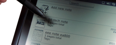
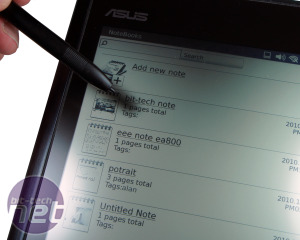
The Eee Note's hardware is absolutely built around note-taking. The touch-sensitive display is actually a Wacom pad style device that requires the provided pen and not your finger to use - it's a good thing there's a spare stylus in the box!The stylus isn't just a fancy plastic stick, either. It has tiny coils in the end that lets the display read the magnetic field strength to understand not only where it is, but how close it is. This means you can rest a the palm of your hand on it to write freely and more naturally without fear of it sensing your touch.
We found out the hard way that it's absolutely crucial to calibrate the display too. This is because the actual display is a millimetre or so below the actual writing surface, so what the Eee Note picks up depends a lot on how you hold the stylus. For example, since the display is 'looking' directly upwards, holding the pen more vertically means it 'sees' it more directly and precisely, but angle the nib and your writing strokes away from that and this translates your input to always appear too low.
Once you find the calibration option, which is buried in the OS settings, things get a lot easier to use. Unfortunately, there's only one global profile, so if you share the device between a family, or lend it to a friend, you'll constantly be resetting it.
The display is very fine-grained, with 0.01mm dot pitch. This puts it on par with a Wacom Bamboo for sensitivity, and even though the Eee Note has a 'last generation' 624MHz Marvell ARM11 CPU at its heart, it can really keep up with handwriting and scribbling in real-time, no matter how fast you try to outrun it.
The downside is control isn't as intuitive as we'd like. It's not a fault of the Eee Note, per say, but if you've used any other tablet or smartphone device, the natural tenancy is to try and use a finger to touch the screen. Give it to anyone else and there's an inevitable five minutes of explaining how to use it; the Eee Note requires patience.
The other thing we found was that users expected a colour display. On more than one occasion we handed the Eee Note to someone and heard them say 'the colour's a bit crap'. Trying and failing to resist not to sound like a smug git, we corrected their assumption; 'Well, that's because it's greyscale only, fnar!'
Inevitably, the next question is, 'why?' - after all, it's not the mid-90s. The Asus product manager explained the colour version of what's used in the Eee Note display is just not ready yet, but the design team is aiming to have it in the next generation.
As far as reading eBooks note-taking goes, you can easily live without colour, but it's another concession. The benefits of the 768x1024 (3:4) display is that it's pixel density is great for its size, and it's lightning fast compared to eInk. The latter gives it a huge advantage as the 0.1 second screen refreshes feel very natural and modern, and we understand the non-backlit design means it is far easier to read for longer too.
However, we still found ourselves struggling to read from the Eee Note on more than one occasion, because the contrast is just not that great. The background is more mustard-grey than white, so it's still no replacement for paper in the low-light situations, such as a lecture hall or meeting room with just the projector on. Having said that, in a normal house, classroom or office, it's perfectly fine and the anti-glare cover works well to diffuse the light from everything except directly overhead bulbs.

MSI MPG Velox 100R Chassis Review
October 14 2021 | 15:04





Want to comment? Please log in.