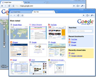
Google is currently performing internal testing on a neat new tool called Flipper, which attempts to make the Google News interface more like paging through a series of magazine clippings.
As reported over on TechCrunch, everyone's favourite data warehouse and advertising broker has revealed a screenshot of Flipper, a new interface to Google News which is due for launch in the Labs.
Enabling users to sort content via keywords, pre-defined sections, sources, and the always popular “most popular” category, the Flipper view borrows quite a few features from the newly-introduced visual history feature that Apple's Safari 4 browser brought to the table.
Displaying each page as a pre-rendered snapshot in a magazine-style aspect ratio makes rapid browsing of content a cinch, although could make it harder to find the best article on a particular subject. With only a single screenshot to work from, it's difficult to know if there's any Ajax cleverness going on to allow a smooth scrolling and zooming experience – although knowing Google's tendency to go for the most basic interface in order to keep the experience fluid across platforms it's unlikely.
Sadly, anyone that likes the look of Flipper will have to cool their jets: while the tool is due to hit Google Labs at some point in the near future, current visitors to the URL are presented with a message telling them to “visit this page from any computer on the [Google] corporate network to automatically enable access for your account” - meaning the pre-alpha build is currently restricted to those lucky Googlers working in the dream factory.
Do you think that a snazzy new interface is exactly what Google News needs, or does the company need to work on separating the wheat from the chaff before worrying about visuals? Share your thoughts over in the forums.

MSI MPG Velox 100R Chassis Review
October 14 2021 | 15:04


Want to comment? Please log in.