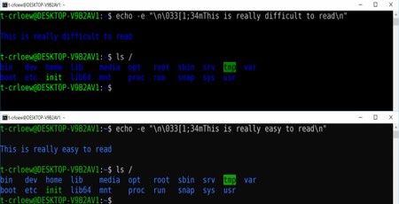
Microsoft has announced an overhaul to the appearance of its operating system representing the biggest change to this particular aspect in over two decades - but don't worry if you don't notice, because it's only affecting the command prompt.
In the early days of text-based command-line interfaces, you could have any colour you wanted, but only by replacing the ink ribbon in your teletype terminal. When cathode-ray tube (CRT) displays became the norm, the interface remained a single colour selected entirely dependent on the phosphor used for the CRT. As colour displays replaced single-colour displays a rainbow of options became open to developers, but while devices like the Commodore 64 (shades of blue), Commodore 128 (shades of yellow), Sinclair ZX Spectrum (black on relaxing grey), and Dragon 32 (black on energising neon green) played around with these, for IBM PCs and compatibles the stock grey-on-black of the monochrome monitor era remained the norm.
When Microsoft's Windows Command Prompt - previously the MS-DOS command interpreter COMMAND.COM, later CMD.COM - switched to a full-colour scheme, it was designed to make it easier to discern things like folders (blue) from the interactive prompt (traditional grey). In the more than two decades since their introduction, though, these colours have remained unchanged - and that, Microsoft intern Craig Loewen argues, has been a thorn in everyone's side.
'Windows Console's legacy blue is very difficult to read on a modern high-contrast displays' Loewen, who is interning at Microsoft over the summer, explains in his announcement of the shift. 'During the past 20 years, screens & display technology, contrast ratio, and resolution have changed significantly, from CRT's through TFT LCDs to modern-day nano-scale 4K displays. The legacy default scheme was not built for modern displays and does not render as well on newer high-contrast LCD displays. This is particularly apparent with deeply saturated darker colours like blue. The new default colours will modernise the look of the Windows Console and make it more congruent with other terminal experiences, such as the integrated terminal in VSCode.'
The changes, though, won't be immediately apparent. Loewen explains that those upgrading through the first release to include the revamped colour scheme, Windows 10 Build 16257, won't see any difference. 'If you upgraded to this new build of Windows, you will still see the original legacy colours, not the new defaults,' he warns. 'This is because we do NOT want to overwrite any of your existing custom colour settings. We'll soon be publishing a tool that will help you apply this new scheme and a selection of alternative colour schemes to your Windows Console.' Those clean-installing Build 16257 or later, meanwhile, will receive the new scheme by default.
For anyone eager to try out the new colour scheme without reinstalling Windows 10 or waiting for the update tool, Loewen has provided RGB values in his blog post.

MSI MPG Velox 100R Chassis Review
October 14 2021 | 15:04


Want to comment? Please log in.