When it's good, it's very, very good...
We'll start out my impressions of Joost with the positives, because frankly there are a lot of them. Installation of the service was an absolute cakewalk across all three systems, and I had no compatibility problems or issues across the large variety of hardware. For a beta, this is a great sign.When you first start Joost, you are greeted with a rather colourful log on screen. After entering my username and password, I was immediately welcomed with a video illustrating the breadth of Joost's content. Once I had seen it on one system, I went ahead and skipped it on the other two -- a handy feature.
If you don't immediately navigate to the channel screen, Joost will pick a piece of popular content and start playing it for you. This content may or may not be to your taste (I got to see Sean "Puff Daddy" "Puffy" "P-Diddy" "Whatever my name is this week" Combs perform his latest music video), but it is nice that the program doesn't sit idle and expect you to start the show. However, this does have one caveat -- if you're new to the service, it doesn't really tell you that this is just filler while it waits for you to choose something, either... so you may think you're still watching the intro movie.
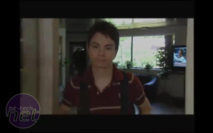
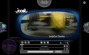
Joost contains a variety of content. Not all of it may be to your taste, but some of it almost surely is.
Getting around
Navigation in Joost is both surprisingly simple and efficient. Controls appear over the top of the content, centred on the four edges of the screen. At the top is an image of the channel you're currently watching, to the left is the icon to bring up the channel display, to the right is the icon for "My Joost", and on the bottom is a panel of controls for the current content.The whole navigation display disappears moments after you stop moving your mouse, and reappears when you click anywhere on-screen or move the mouse vigorously . Small movements will not bring the panels up, a nice addition since the top and bottom portions cover over parts of the content.
Each of the navigation pieces is semi-transparent, which is a two-fold benefit: First, it doesn't get in the way of the content. Second, it just plain looks nice. Each icon is fairly self-explanatory, but if you're stuck a small tool-tip will appear if you hold your pointer over anything.
The content control panel on the bottom features the usual play, pause, and position bar that we've come to expect from just about every media player in existence. It also has commands for navigating between the channels and between pieces of content in the channel. So essentially, this panel contains everything necessary to run Joost -- which leaves us wondering why the other icons even exist.
It also has control to go from full-screen to window mode, which will display the content in its proper 1:1 size. Since all of the content currently is in standard definition, that means a fairly small window, making it optimal on laptop displays but a little hard to view on larger monitors. On my MacBook, the windowed mode was perfect viewing while I wrote some content. Using my 1680x1050 Samsung 215TW monitor on my desktop machine, this was nowhere near so perfect. Though the window could be dragged to increase its size, a switch to full-screen and back again shrank it back down to the original dimensions.
Oh, the channels we'll see
The current level of content in Joost could best be described as "broad, but not deep." There are 23 active "channels" on the service currently, covering everything from music videos to National Geographic specials. Indeed, it's hard not to find something that interests you, even on this limited beta.Support for further channels will likely increase as soon as the service gets some business legs under it, but it's great to see some heavy hitters already backing Joost. MTV has loaned its brand support in both music videos and its ever-popular Comedy Central channel. Sadly, some of the good original MTV content hasn't appeared yet, such as my personal favourite, the US version of "Pimp My Ride."
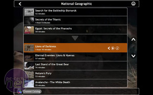
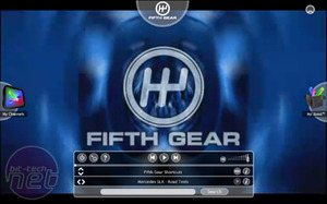
Top quality content like National Geographic and Channel Five's Fifth Gear help bring Joost some much-needed star power.
National Geographic has also worked closely with Joost and has included some of its best specials, including "Discovering the Bismark" and "Secrets of the Titanic," two of its most sought-after pieces. It's also included a lot of more recent documentaries, including a piece on lions and hyenas that I found quite fascinating.
One of the great things about Joost is that it isn't as regionally limited in content. For instance, Channel Five has contributed several favourite shorts from the popular show "Fifth Gear," which we don't get to see over in the States. I was first introduced to the show when Richard came to visit, but have not found it on American TV since.
Once you have selected a channel, the list of shows for that channel appear. Select a show and it will play immediately, with no advertisements. If you let it run from episode to episode (which it will do automatically), you will be subjected only to a brief five-second spot showing "This content presented by" and a sponsor. These brief adverts are a great way to keep the price down while not annoying the end-user. If you manually change the content, you don't have to see them -- but since they're so short and contain no obnoxious sound, there's little reason to actively avoid them.
My Joost
One of the "less-useful but still nice" inclusions in my book is the "My Joost" feature. It contains a number of widgets (that can be added to) similar to the sidebar of Vista or the Dashboard in OSX. Currently, these widgets are limited to things such as a "channel forum" where you can talk about what you're watching with others who are watching the same thing. All in all, it's a nice little extra, but I would personally rather just watch my show, particularly since other widgets will cover the screen while I'm posting in the forum.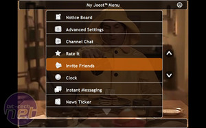
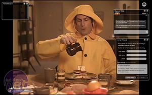
The My Joost menu features some widgets. All we have to say about that is, "Why?"
Though I'm sure some clever people will develop widgets that are somewhat beneficial to have at a moment's notice whilst watching my show, for now it's more of "that button on the side." It doesn't do much that is worthy of interrupting my viewing experience, which is the whole reason I would be running Joost anyway. To me, adding a "feature" that prevents you from enjoying the primary purpose of the software seems contradictory. However, this is the beta, and I expect that a few kinks might get worked out and added functionality brought in soon.

MSI MPG Velox 100R Chassis Review
October 14 2021 | 15:04


Want to comment? Please log in.