Let's clear something up...
Since we've touched on response time, we should really mention one thing on the "millisecond myth." I'm not entirely sure where this got started, but it is starting to drive Tim just about bonkers (has driven me bonkers, surely? - Ed.), and I can't really blame him.For those of you unfamiliar, that's the belief that a lower response time is equivalent to a better display, particularly for gaming. In reality, there is very little difference between a 16ms display and a 2ms display. The entire system is capped at 60Hz (60 frames per second) to begin with, which means that there are 16.67ms between frames. No matter how quickly a pixel changes, anything faster than 16.67ms will not be noticed.
Further, the methods of measuring "response time" seem to vary to the point of it being an almost useless comparison. For instance, by ISO standards, response time is supposed to be measured from black to white. However, many companies trying to pitch for speed have determined that the more common operation is from one grey to another, and so instead advertise grey to grey - a much lower number in any display.
What can be assured is that any display that is able to advertise a 2ms response time is obtaining that (completely unnecessary) rate by using less bits of colour per channel. Any display advertising less than 8ms is assuredly only 6bpc, which as we discussed is less than two percent of the colours available in 8-bit panels. There is simply not the time in current technology to make 8-bit alterations to the liquid crystal.
Dither me this...
So how does a 6-bit panel come out looking even halfway like an 8-bit panel? Well, if you look hard at an 8-bit panel for a minute, the answer is "it doesn't." But for those who haven't really had the privilege, there is a more technical answer. The 6-bit panels come "close" to True Colour (8bpc) by using a technique called dithering - taking a group of pixels in between two different colours and slowly introduce more dots of one colour than the other.
6-bit panels use an effect called dithering to approximate the look of an 8-bit panel.
Dithering can work quite well in certain circumstances like large gradients, close colours, etc. However, it really begins to fall apart when there are small amounts of space to make a fairly large colour transition - such as fire, where a flame may move from yellow to red, or smoke, where there can be quick changes between blacks and greys. Soft shadows, water and particle effects have particular difficulty and start to look either banded or pixellated on a 6-bit display, a problem which often gets blamed on the effect or the game engine.
Empty spaces
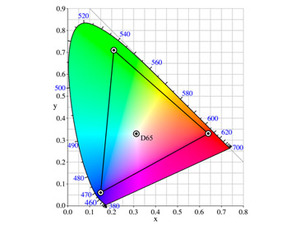
As with anything, the idea behind RGB colour is...imperfect, at best. CMYK suffers from a totally different set of issues, though it fixes some of the shortfalls of RGB. What's worse is that the two are not at all the same - if you print an RGB image, it will never look quite like what was on your monitor.There are myriad reasons for this, but the biggest one is the fact that this is a colour space, not a colour world. What is a colour space, you ask? Well, if you make a horseshoe out of the visible spectrum that we displayed as a line on the first page, you have the colour world. You'll see that white is in the centre of that, as illustrated in the images above. A colour space is defined by picking points within that horseshoe as your primary colours.


Left: sRGB works well for displays, but doesn't transition well to the print world.
Right: Adobe RGB is designed to approximate subtractive CMYK colour on an additive colour RGB computer screen.
Since we have three - red, green, and blue, we will pick three points. When you draw lines between those points, everything inside of those lines can be reproduced faithfully. Everything outside, well, can't. In the Standard RGB colour space (sRGB), you'll see that you can reproduce about 50 percent of the colour spectrum faithfully, mostly lacking in the green/cyan area. It sounds pretty limited, but sRGB is doing the best it can with what technology you're working with - additive colour has some limitations.
It gets more difficult when you go back to the fact that your beautiful RGB picture won't necessarily correlate to subtractive colour when it comes time to put ink on the paper. The CMYK colour space actually is very rich in greens and cyans, but falls short in reds and blues. And due to its nature as a subtractive colour method, it can't be used to power your LCD or CRT monitor - this problem has wreaked havoc on graphic designers, editors, photographers and everyone wanting to just print out a nice, clean picture from their computer.
In an effort to get a little more true-to-life in the print world, many very high end monitors come with a setting for "Adobe RGB," which is a colour space designed by Adobe in 1998. Adobe RGB fixes several of the problems that sRGB (standard RGB) faces when transitioning from the computer screen to the printer, which has been a great benefit in the publishing and design industry.

MSI MPG Velox 100R Chassis Review
October 14 2021 | 15:04


Want to comment? Please log in.