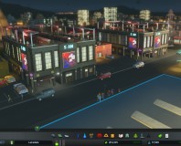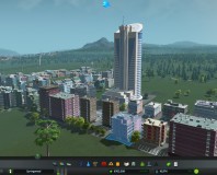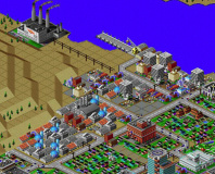
Simcity Preview
Publisher: Electronic ArtsPlatform: PC Exclusive
Release Date: TBA 2013
The initial impression for Simcity isn’t positive – “It looks like a prettied-up, watered-down version of the old Simcity,” you think to yourself. Who would ever want to play something that’s so clearly and obviously been diluted for mass consumption and merely perpetuates Maxis’ slide downwards towards all things The Sims and kid-like? That’s what you’re wondering.
But, wait…just wait for it…any minute now the man running the demonstration is going to build a power station and when he does everything is going to suddenly, effortlessly click into place.
Here it comes. He’s clicked the toolbar at the bottom, selected the coal power station he wants to build and he’s choosing where to place it on the map. As he swings the cursor across the landscape, a 3D model of the building hovers above the pointer, catching the momentum of the movement and swaying slightly as it goes. Click, he plops it down and, as he does, the building starts to hastily assemble and a bunch of buzz-saw and ratchet noises start to emanate from the construction site. Tiny sim-people are appearing in little vans, tools and ladders piled in the back; a brick chimney shoots up in the air triumphantly.
Suddenly, it clicks and you realise where you’ve seen this sort of action and kinetic feedback before; in your head, as a child when you played with your toys. Simcity, with its brum-brumming cars and buildings that feel real before they’ve even been built, is like a Playmobil world. The world is a literal toybox.
Once you’ve made that realisation, Simcity’s clean presentation and caricatured 3D models suddenly start to make a lot more sense; you start to understand that the game isn’t just childlike, but possessed with a childlike joy. This manifests in every interaction you seem to have within the game, from choosing where to place a factory to positioning electricity pylons – whose cables stretch and snap should you stress them too far. Even watching your little Sim populace move around the city reveals that they bob along with a certain stiff-limbed animation that’s reminiscent of Lego minifigs.
If Simcity is a toybox though, then it’s the most advanced one we’ve ever seen, weaving together all the complexity you’d expect and more of this on top. In order to build a successful city – or to engineer whichever apocalypse you feel like – you’ll need to stay plugged into a wide variety of data. Emergency response times, crime rates, wealth, travel infrastructure and so on are just the start; you’ll need to know not just how well supplied the power grid is, but also how much surplus energy is left and which areas get electricity priorities. What are the long term ramifications of choosing coal over wind power, of dividing your city into districts divided by wealth or industry?
It’s here that Simcity’s other influence comes into action though, making much of this information accessible at-a-glance and without rows of numbers or colossal tables. Instead, Maxis draws inspiration from Google Maps to present much of this information as data layers that can be overlaid on your standard viewpoint.
Much of the information in these data layers is so intuitively presented that assessing the entire city in one look is not just possible, but the norm. The power layer, for example, shows yellow pulses of electricity heading out of power stations and routing around the level, but bolt a couple of upgrades on to the generators and you’ll see the pulses become bigger and faster. You’re now making more energy, more efficiently, the data layer communicates implicitly.

MSI MPG Velox 100R Chassis Review
October 14 2021 | 15:04


Want to comment? Please log in.