
Dragon Age: Controls
On PC, the controls in Dragon Age: Origins are simple and very conventional. Along the bottom of the screen you have your array of available skills and spells, while on the left edge of the screen you have the floating buttons for your team members and can cycle through them at will or judge their health and mana at a glance.Everything else in the PC version of Dragon Age is broken down using hotkeys – press ‘I’ to pull up your inventory or ‘M’ for your map if you don’t want to use the on-screen icons. At any time you can pause the game and hand out some immediate orders for your party of four adventurers, meaning that you can slow down the action and get a breather whenever if all gets a bit out of hand. Being able to pause a time is a handy ability, one that we’ve made frequent use of in our past hands-ons with the game and which we’ve regularly wished we could use in real-life.
We’re not the only people who occasionally wish they have in-game mechanics in real-life, right? Maybe we should have quicksaved before we admitted that.
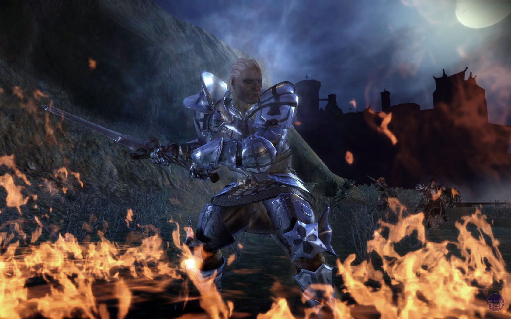
Click to enlarge
On PC the view point can also be zoomed out massively, taking the camera from the up-close point of view of Knights of the Old Republic to the almost top-down view point of Baldur’s Gate. Though there are some subtle differences between the two games. Baldur’s Gate really is a good reference point for how the interface of the game works on PC – unsurprising given that Dragon Age is the spiritual successor to Baldur’s Gate.
On console though, the game is almost totally different. The grid of magics and abilities along the bottom of the screen is mapped to the three of the four face buttons and shifted over to the bottom right of the screen. You can assign different things to these buttons and by holding one of the bumpers you can put a ‘shift’ on them and have another three abilities, but it’s still a reduction. You’ve gone from ten or twelve quickly accessible skills to just six and, most importantly, you can’t pause the game and hover the mouse of them for a tool tip if you forget what type of damage they deal or what school of magic they belong to.
While it was hard to appreciate the specific effect that this reduction had in our hands-on time with the game, which perhaps deliberately set us up with a lowly mage with only a handful of available spells, it wasn’t hard to extrapolate. You’re basically being forced to hone your tactics down to a general reliance on just a handful of different abilities for each character, rather than being able to quickly adapt on the fly. You can still use abilities that aren’t mapped to the face buttons obviously, but that involves a fair bit of menu hopping.
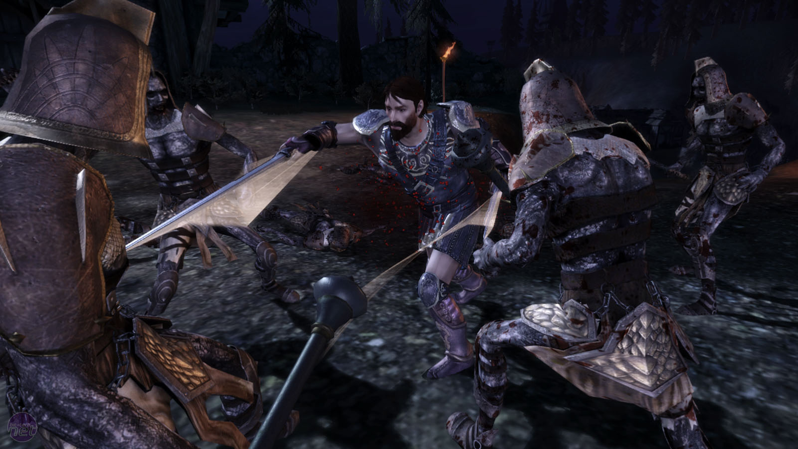
Click to enlarge
Accessing your other, non-button mapped skills requires delving into the radial menu and it’s here that things obviously get a little tricky. Radial menus aren’t bad per se and they’re doubtlessly one of the better solutions that developers have found for making RPGs and RTS’ accessible on consoles – but they aren’t perfect. They have flaws, one of which is there’s only so much you can cram into a radial menu before it gets too cluttered to use.
BioWare’s other recent console RPG, Mass Effect, used a radial menu of a sort – one that was pretty good. The menu in Dragon Age is different to that though. Not only does it not fill the screen entirely as Mass Effect's tactical menu did, but it has more things on it. Mass Effect was essentially a shooter – go here, shoot that, use Biotics on him – but Dragon Age is much more of a classic RPG. There are potions and salves to make, scrolls to read and characters which may have completely different abilities to each other. The result is that when the radial menu is overlaid on the original UI, the whole thing looks far too complex.
Jumping into the different menus, then having to use the bumpers to cycle through the different sub menus isn’t very intuitive and, though it may be because the code we were playing was still an early and unrefined version, it was still decidedly clunky. There was an uncomfortable half-second pause between each submenu, which makes jumping from the Armour to the Lore menu a bit of a pain.
RELATED ARTICLES


MSI MPG Velox 100R Chassis Review
October 14 2021 | 15:04

Want to comment? Please log in.