
The Wow starts Now
Thus runs Microsoft's slogan for the Vista experience. Users, we are told will be blown away by the swanky new graphics and interface that Vista brings to the party. We've all heard the catchphrases - 'Aero Glass', 'Sidebar', '3D flip' - but what do these things actually do, and are they any more than rudimentary eye candy?Aero Glass:
This is the name that has been given to the new UI, and it stands for Authentic, Energetic, Reflective and Open. You can only get Glass by running a 128MB DX9 card in your system, since much of the fancy graphical effects are actually done by the graphics card. This is a similar approach to Mac OSX, where graphics cards are roped in to manage translucency, scaling and the like.The similarities to OSX don't end there, either. The jewel-like buttons and translucent windows are reminiscent of those that Mac users have been enjoying for a couple of years now. However, it's new to Windows, so we can't really mark it down for that.
So what are the real differences? Well, not many - it really is just eye candy. Notification balloons (now translucent) are a little less intrusive, fading in and out a little more pleasantly, rather than being the jarring yellow patches of death that they have been before. The new default font is Segoe UI, which, now at 9pt rather than 8pt, is rather nicer to browse the net with.
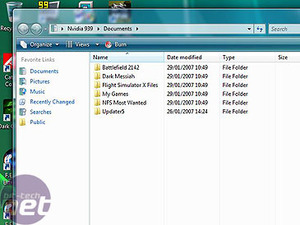
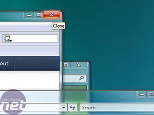
Aero windows are translucent and have shiny buttons.
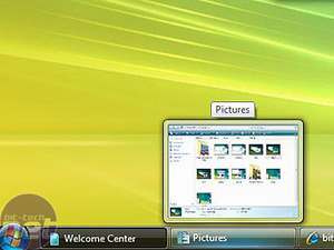
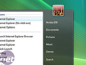
Windows now have thumbnails in the task bar, and the Start menu is also tastily translucent.
Start menu:
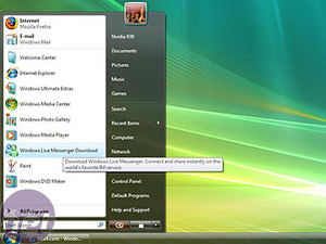
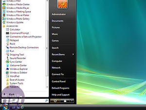
Rather than the Start menu, the word 'Start' is now replaced with just a little circular Windows orb. Rather than clicking more programmes and then navigating through a series of menus, installed applications now appear within the menu itself. This tends to make things a little more crowded, but does avoid the problem of having to navigate halfway across the screen to get to the programme you actually want.More interestingly, there is now a search box within the Start menu itself. This is an 'instant' search, far better than the good-for-nothing old XP search and is far more akin to Google Desktop Search or, dare we say it, Spotlight. In our time with Vista over the last few months, we found that the search really is much more reliable than the old XP search, and the indexing of files as you work really isn't noticeable. However, we found that spending some time tweaking the properties of the indexing system yielded better results, telling it to look in folders we commonly store stuff in, rather than just Documents.
Flip:
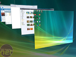
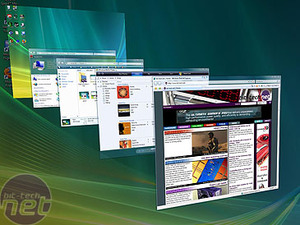
This new feature is ALT-TAB on steroids. As you Tab through programmes with WINDOWS-TAB rather than the former, you get a live preview of the window you're looking at, and the windows cycle round in a rather pleasant carousel. Immediate comparisons can be made to Expose in OSX, but the functions of the two are rather different. Expose is designed to show you everything running (scaled right down) then let you click the one you want - Flip shows you just one thing at a time, but makes it easier to see what each window is. Whether you use it or not will really depend on how much you currently use ALT-TAB.Sidebar and Gadgets:
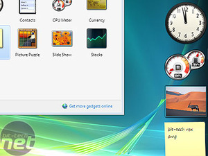
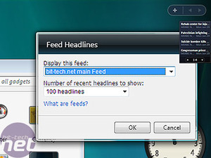
Designed primarily for use by those with Widescreen monitors, the Sidebar is really a dock to drag common applets to. You can use it to house RSS feeds, or Gadgets (little AJAX applets like OSX Widgets) such as a calendar, to do list, photo viewer or sticky note. Opinion in the office is divided when it comes to the sidebar - one half of us thinks that it's a great addition, and handy for keeping little bits and bobs of info that you need constantly. Others think it's a sucker of screen space, hogging real estate for no good reason. It's easily turned off, so you can have it either way.
MSI MPG Velox 100R Chassis Review
October 14 2021 | 15:04



Want to comment? Please log in.