Home Page
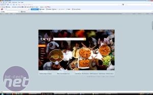
The home page is probably the most subjective area so let's get it out of the way before moving on to matters such as results relevancy and features. Clearly there are two very different approaches to home page design here. Let's take a look at Bing first.If anyone remembers the Live Search homepage, you can see that Bing is a striking improvement. The picture changes daily, cycling through beautifully photographed and extremely vivid shots of natural scenes. In addition to the eye-catching colours, you can also mouse over points in picture to get facts based on the photo itself.
For example one mouseover point in this photo tells you that 'open air food markets are only one of things you can see when you visit Bangladesh' with a link underneath inviting you to find out more. The link leads to a selection of YouTube videos showing you what's on offer in the Indian republic.
Aesthetics aside, Bing is part of Microsoft's online arsenal which means it provides links to MSN and Hotmail from its home page. These are two services that are used en mass and it's a definite brucey-bonus having them neatly tucked up in the corner if you were to have Bing as your homepage.
Other links from the homepage are present in the form of popular searches and one called 'get cash back' whereby Microsoft has actually teamed up with eTailers to provide people with cash back on purchases made through the search engine. At the moment it's not known whether this feature will make it to the UK, but it's a damned fine reason to think about using Bing for purchasing new toys at the very least.
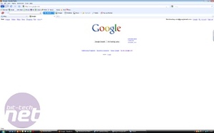
Google's home page is much simpler and arguably more to the point. While it's all good and well to have attractive photography and links to beautiful parts of the world on the home page, if you're looking to find a deal on a digital camera quickly then you might not be interested in open-air street markets in Bangladesh.
With the company's established status, you could argue that this page has become something of a design icon too and has changed very little since it first hit the internet about 10 years ago. Google also mixes up the visuals a little by changing its logo on the home page to fit in with national holidays or sporting events and a lot of the designs are clever and well drawn.
Despite its initially simpler appearance, the Google home page offers more features than Bing, no doubt a result of being up and running for a considerably longer period of time. From Google you can check up just about everything from finance, to books and blogs. In addition to this Google also has a myriad of services such as Google Docs and an RSS reader which are handy things to have bolted to your browser home page.

MSI MPG Velox 100R Chassis Review
October 14 2021 | 15:04


Want to comment? Please log in.