
Graphics
We’re going to be brief here because, to be honest, while the graphics in Red Alert 3 are good, they aren’t wholly different from those seen in Tiberium Wars or Kane’s Wrath, mainly because it uses the same engine. And yes, that means that the frame rate is still limited to 30 frames per second.It also means that the game has similar requirements to the previous games – under Vista that’s a 2.2 GHz CPU, a gigabyte of RAM, a 128MB graphics card, but under XP the requirements are about half that.
If you’re really interested to see the details of the engine then you can check out the graphics analysis for Command and Conquer, but below we’ve got the essential information.
Graphics Presets
Red Alert 3 comes with five graphics presets; Ultra High, High, Medium, Low and Very Low. The differences between those settings are incremental, so we’ve reduced the options to Ultra High, Medium and Very low.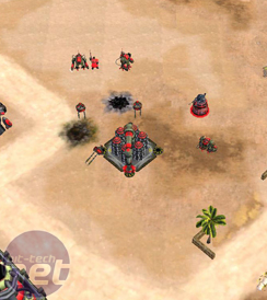
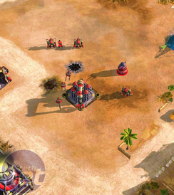
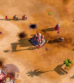
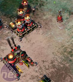
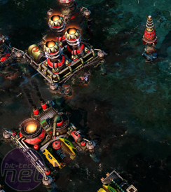
Graphics Presets in Red Alert 3 on Very Low (left), Medium (centre) and Ultra High (right), click to enlarge
The good news then is that the game, on Ultra High, looks great. The terrain and units are detailed, the shadows are dynamic and so on and so on. The game looks good.
Scaling down to the Medium setting, the game looks OK, but not great. The amount of detail in the terrain has been lessened, so the tire tracks and dirt have started to disappear. The whole screen is made lighter and brighter by the fact that there are less shaders in use and the amount of detail on the buildings starts to get reduced.
On the Low setting, the shadows are no completely gone and the desert our base is resting on is starting to look like more like an orange meringue than a sandy beachhead. The textures on the buildings has seriously decreased and, all in all, this is a setting that’s best avoided unless you find yourself gaming on a laptop from yesteryear.
Water Detail
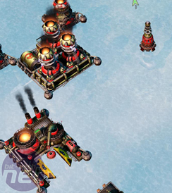
Red Alert 3 has a renewed focus on naval combat, so you can expect a lot of time to be spent looking at an ocean. There are submarines, boats, ships and Japanese transformers that change from one to the other. Oh, and dolphins too.Above, you can see the different detail settings for the water in Red Alert 3 and the huge effect they have on the look of the game.
On the Low settings the game looks flat, dull and far too bright – an effect which is consistent with the lowering of any of the settings. There’s no visible depth to the water and no fancy wave or splashing effects – though at least we can use a load of technical terms like ‘splashing effects’.
On the Medium setting, the view looks better...but shinier too. This is more like how the water should look...but there’s something about how uniform that shininess is that puts us off.
We prefer the High setting, where the water has some awesome distortion and rippling effects and sends up great plumes of spume when something explodes in the water. This is the type of water that Sonic Dolphins should be happy to move through.

MSI MPG Velox 100R Chassis Review
October 14 2021 | 15:04



Want to comment? Please log in.