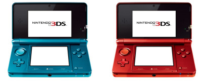
3DS Review
When it comes to the larger issues of design and usability, the 3DS itself is instantly recognisable as a part of the DS series. The chassis itself is bigger and more angular than the DS Lite or the DSi and the top screen is significantly wider. It’s also heavier and chunkier – 230g compared to the 214g of the DSi.The extra weight is easily justified though, even without retreating to the core 3D feature; the 3DS' screen is now capable of 24-bit colour, rather than 16-bit, and the top screen effectively offers a resolution of 800 x 240. You have to divide that resolution by the number of eyes, but even then the 400x240 resolution trumps the 256 x 192 of older models. Meanwhile, the lower screen offers a 320 x 240 resolution, despite being a fraction of an inch smaller than the DSi's lower screen.
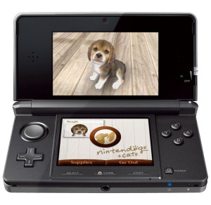
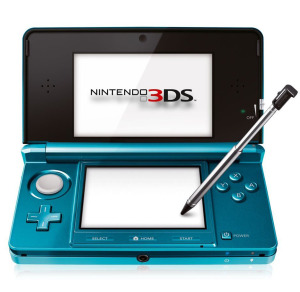
There are also some changes to the inputs, with the most notable being the addition of an analogue stick above the D-Pad. While this may summon immediate comparisons to the PSP’s temperamental nubbin, the 3DS version is in a class of its own – thanks mainly to a recessed, non-slip surface that makes it easier to manipulate. The stylus has been upgraded too, so you now have a telescopic metal version that’s stubbier and thicker than previous versions.
Nintendo has also added and tweaked many of the other buttons on the 3DS, moving the volume slider to the left edge of the handheld and spring-loading the wireless toggle on the right edge. The 3DS' core wireless feature hasn’t been upgraded from the 802.11b/g receiver of previous models, but it has been complemented by a new IR port.
More buttons have been moved inside the 3DS’ clamshell too, most notably along the bottom of the lower screen where the Select, Home and Start buttons are now located. The Power button is now located here too, off to the right. Unfortunately, we didn’t find that these buttons made navigating the 3DS’ OS any easier, though – there are constant prompts about idling programs in the background and the fussy matter of selecting either Sleep or Power Off whenever you press the On/Off button.
The most important switch is definitely the 3D-effect slider, though, as this lets you customise the impact of the 3D visuals. Located on the lower right edge of the top half, this slider lets you slide between full 3D and no 3D effortlessly, without altering or slowing down the games themselves. This makes it perfect for when you want to show a game to a friend – as pals peering over your shoulder won’t see the 3D effect – or when you want to take a break.
That said, the OS is prettier now, at least. It’s been brought closely in line with the Wii OS, with a sickeningly sterile-sweet white and silver UI, complete with bird noises. The Miis show up too, so you can create a plastic, Playmobil version of yourself complete with permanent rictus-grin, if you want.
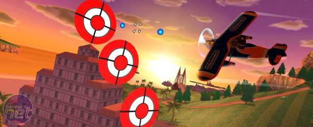
There are cameras too, by the way. Multiple. A standard 0.3 megapixel camera sets on the inside of the clamshell, as with previous models, watching you as you play. The picture quality isn’t great – unchanged from the DSi – but it’s unlikely you’d ever want to use the 3DS as your defacto camera anyway. It’s mainly there for rare integration with games, as is the case with the two cameras on the exterior of the shell, which work together to take 3D photos. Again, this isn't a must-have feature, but it's fun nonetheless – and handy for the augmented reality game that comes bundled with the 3DS.

MSI MPG Velox 100R Chassis Review
October 14 2021 | 15:04





Want to comment? Please log in.