
Nintendo DSi Review
Manufacturer: NintendoUK RRP: £149.99 (inc. VAT)
US RRP: $169.99 (ex. Tax)
Release Date: April 3 2009
The DS handheld platform has been incredibly successful for Nintendo, especially in the grossly improved Lite SKU, but if the GameBoy has taught us anything it’s that Nintendo is a company that doesn’t like leaving things alone. Nintendo is a company with idle hands which love fiddling, usually by adding on rubbish that nobody needs. GameBoy Printer, anyone?
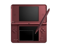
The fact that a new version of the DS would eventually come about hasn’t been all the surprising. Some of the design decisions Nintendo has made are a lot more shocking though, fundamentally changing some of the features of the platform. There’s new firmware, less ports, refined hardware and a new chassis – but that’s barely scratching the surface.
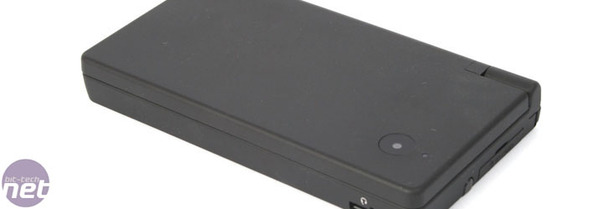
Scratching the surface is probably the last thing you want to do though, because Nintendo has changed the finish on the DS’ clamshell as well as tinkering with the innards. The DS used to be a shiny fingerprint magnet, but now it’s got a matte finish that feels like rubbing wet cotton wool together. The DS used to collect greasy streaks on its outer shell, but now it accumulates dirt and scratches more easily instead.
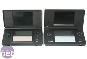
Any misgivings we have about the new finish though are balanced out by how impressed we are with the re-designed insides. Nintendo took the lessons it learned about the original DS and applied them to the DS Lite, swapping that farcical futuristic look for something a lot more chic and making the buttons and stylus much more ergonomic, and it’s done the same here. The ergonomic improvements make the DSi much more satisfying to use.
The DSi is 12 percent thinner and a trifle longer than the previous model, which isn’t as easy a statistic to make rude jokes out of as you’d expect. Where the DS Lite measured 133mm by 74mm by 22mm (WxDxH, when closed) the DSi is now a subtle, but appreciably smaller design, measuring 137mm by 75mm by 18mm when closed.
Spouting figures like that is only so useful though (but don’t let Richard and Tim hear me say that). What it really comes down to is that when you hold the DSi in your hands then it feels ever so slightly, but immediately noticeably thinner and bigger.
Just because it’s smaller on the outside though doesn’t mean that it’s any smaller on the inside. The DSi is like some sort of gaming TARDIS in that it’s actually a lot roomier inside than you might think. The screens specifically are bigger than the displays on previous DS SKUs, enlarged from three inches to 3.25, almost totally filling the chassis.
Powering this larger display is a bundle of new hardware too, including a whopping 16MB of RAM, which is four times more than previous models and a small amount of storage space. It’s a shame that the extra memory doesn’t appear to actually improve in-game performance though, mainly because the DS is a closed platform and games are designed explicitly for its individual configuration. We played a few games on the DS Lite and DSi and saw no performance increase, though we did take the chance to confirm that single and multi-cart play is still possible between the DSi and DS Lite.
Another small tweak that Nintendo has devoted some time to is improving the feedback offered by the shoulder buttons, which now protrude a little more from the shell and give a very definite click when pressed. The volume control has been updated too, replaced on the left-hand exterior of the shell and turned into a simple elevator switch rather than a slider, just like on the iPod Touch 2G.
The most important button alteration however is the power button, which has been moved to below the D-pad. Unlike the previous DS models which had to be completely shut off in order to access the main menu, tapping this will drop gamers back to the boot menu without restarting – to power down you need to hold the button down.

MSI MPG Velox 100R Chassis Review
October 14 2021 | 15:04




Want to comment? Please log in.