Graphic Introduction
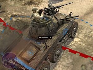
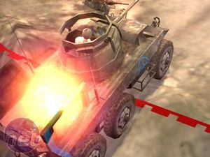
Forget next-generation games for next-generation graphics, the PC is, and probably will always be at the forefont of graphical innovation. Company of Heroes is right at the pinnacle for graphics, giving you the chance to see an RTS game in a way no other has ever allowed. This game even surpasses the beautiful looking Joint Task Force - it looks beautiful at times and suitably dirty at others.The thing that will really shock any gamer is how close to the action you can actually get. You can zoom right up to the characters and they don't lose any of their graphical prowess. When up close it looks near Call of Duty 2 standards, a fact that, although not the be all and end all of a game, is one that will make the experience far more immersive.
There is one thing that seemed a bit lacking in terms of graphics, however. The backgrounds at times seemed a little bit empty and drab, the sky for instance could have been made to look a little more dynamic. This isn't really a concern for most of the game, where you play in environments rich with other details, but at times when I zoomed down onto the battlefield I caught glimpses (or lack thereof) of a rather empty background. Nothing's perfect huh?
I took a look at some of the options you could change in the game in more detail, just to see what kind of effect they had on the visuals and in the search of getting the most out of my hardware for gaming experience.
Textures
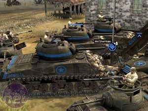
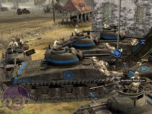
Textures are probably the most crucial aspect to a game either looking nice or ugly, which is why the scale for changing them is always the most drastic. In the screenshot below you can see that the surfaces all become far more dull and boring with textures turned to low. The higher you go with textures the more realistic the units look - a picture speaks a thousand words so take a look for yourself. My advice is to tinker to get textures as high as possible.[/center]
Antialiasing
The smoothing of edges in this game wasn't really noticeable. As you can see from the screenshot there is hardly any difference between the two images despite one having AA turned off (the one on the right). My advice is to just knock it off to gain a little boost in performance as it is hardly noticeable anyway, especially with a decent resolution.[/center]
Terrain & Trees
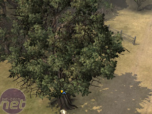
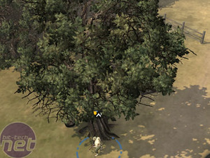
The third graphical option I had a tinker with was the terrain and trees option. Despite these taking away a few FPS I found them highly worthwhile. As you can see in the screenshots below, turning off terrain makes roads and the like look a bit more splodgy (is that a word?) and far less crisp. The definition around the shadows and the soft edges, although not looking that drastic here, are actually quite important whilst playing the game - I found it quite noticeably when I turned these options off.[/center]
One annoying thing about Company of Heroes is the fact you need to leave a campaign mission if you wish to change the graphics. This doesn't help if you're trying to perfect the graphical options. The game does offer the helpful option of running it's own benchmark, giving you info on your highest, lowest and average frame rate whilst running a demo portion of the game. We can't tell you how accurate it is, as we didn't have time to rigorously test it ourselves, but I suppose it can be quite helpful in guiding you on your graphical preference.

MSI MPG Velox 100R Chassis Review
October 14 2021 | 15:04




Want to comment? Please log in.