Championship Manager 2010 Review
Platform: PCPublisher: Eidos
UK Price (as reviewed): £17.99 (inc. VAT)
US Price (as reviewed): N/A
Football – it’s a funny old game, the beautiful game, a game of two halves, and quite frequently a video game too. The world’s favourite sport (unless you’re Joe or Rich) is a perennial shifter of truck loads of copies and be it playing the game, managing the game or playing fantasy premier league with us in the forums, you have to admit the sport has a huge draw.
Our obsession with butting the ball in the back of the net has meant plenty of competition between developers down the years and while the annual battle between FIFA and Pro-Evo usually grabs the headlines, the yearly battle between football management games is just as fierce.
Just as the Premier League hits its stride Beautiful Game Studios, under the flag of publishers Eidos, and Sports Interactive of SEGA loyalty have unleashed their latest salvos in the race to win the hearts (and cash) of fans intent on taking their club to the very height of football greatness in the way that their useless excuse for a manager never could.
Champ Man 2010 strikes first this year, with the franchise having been on the receiving end of an unequivocal drubbing by SEGA’s Football Manager series for the last few years, with players complaining Champ Man lacked depth and was too easy in comparison to Sports Interactive’s Football Manager. Amid claims of a significant game overhaul though, has BGS done enough in rebuilding the franchise for the new season to challenge for top honours or is it a case of yet another relegation battle for Champ Man?
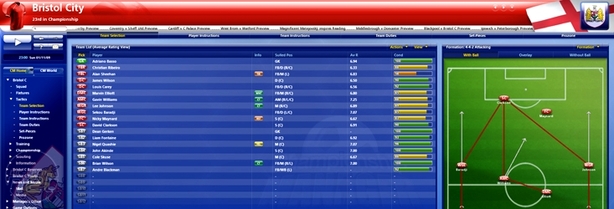
Firing up Champ Man 2010 for the first time the most startling thing is the redesigned interface, which has been stripped right down to the bare essentials. Where once there were batteries of confusing buttons, the new interface is sleek and clean, although we’re not sure about the headache-inducing (but thankfully optional) animated backgrounds.
This swish new interface is all thanks to Champ Man 2010’s extensive use of drop down or expandable menus, which are now used for everything from offering players new contracts through to adjusting tactics as detailed as determining the height of a cross.
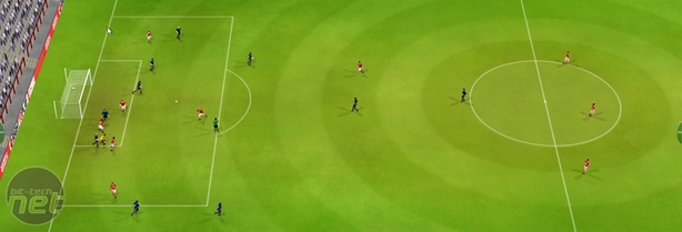
GOAL! You'll want to score these as much as possible
However, while the new interface might look cleaner and more approachable as a result, the use of drop down menus all too often leads to frustration, especially during your first few hours with the game when you’ll often flap vainly for that menu option or tab that’s been so cleanly hidden away.
The extensive use of drop down menus also makes tracking down specific players a challenge, especially when you want to go digging through team’s reserves or youth rosters on the lookout for tasty loan signings. Browsing to a team will, by default bring up the 1st team squad, with the reserves and youth players brought up by a tick box in a drop-down menu - a tick box that’ll reset with every new player selection, sending you right back to the same drop down menu again and again.
It all soon gets a bit frustrating, especially as BGS has obviously gone to such lengths to clean up the interface. They've tried their best, but really they've only produced one that’s even more complex, albeit more visually pleasing, than the original.

MSI MPG Velox 100R Chassis Review
October 14 2021 | 15:04


Want to comment? Please log in.