New Signings
The endless drop down menu’s also get a little tiresome and start to feel laborious when you’re tinkering with tactics too. Absolutely every strategic option, from passing style to propensity to pick up yellow cards is done through tiered drop-down menus, and when you have to do this multiple times for every player in your formation, you soon find yourself longing for a few more buttons instead.Even with the new clean interface some of Champ Man 2010’s layout choices are far from ideal – a critical issue when a player is going to trawling through screens and screens of stats in search of that illusive defensive midfielder or monster of a centre-back.
Player information in particular is a the key culprit, and is needlessly laid out over numerous tabs. Bring up a player and you’re shown his array of stats for the technical, mental, and physical side of their game, but the player’s value, wages, and match eligibility are all kept on a completely separate tab despite there being plenty of empty space on the stats page. It’s a small grumble, but when you’re looking for those new signings it’s a needless hurdle you’ll have to jump hundreds of times.
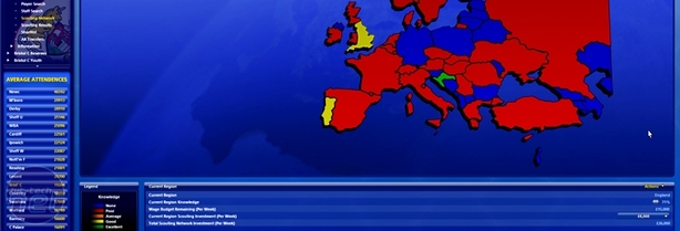
Scouting networks have been revamped
The interface isn't the only new thing though, as BGS has also put plenty of time and effort into bringing in a number of new features that could set Champ Man apart from the competition, one of which is the Scout Network.
While you still need to hire and fire scouts to check out players, you’re now able to invest cash from your wages budget into hunting out talent in any country in the world (although the problem of attaining work permits still remains). It’s a useful feature, with you receiving daily recommendations of players deemed fit to play for your club, although the sheer amount of scouted players can soon become overwhelming and it’s best to just add the cream of the crop to your shortlist for easier perusal.
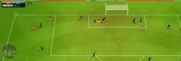
The match engine looks great
Another big addition for Champ Man 2010 is the 3D match engine and we have to say it’s really very impressive. Player animations are great, especially insofar as making you feel like you’re really watching the football highlights – strikers hold their head in their hands when they miss a sitter, players roll around in agony when injured and will appeal to the ref when chasing decisions.
The graphics themselves aren’t anything to write home about of course, and still aren’t a shade of what was possible with a 1996 games console, but they do offer a whole lot better idea of the run of play than simply watching circles dance on a screen. It’s much more clear whether your tactics are working or not, where the run of play is flowing, and which players are having a big impact (or not as the case tends to be if you're playing as Bristol City!)

MSI MPG Velox 100R Chassis Review
October 14 2021 | 15:04


Want to comment? Please log in.