Graphics
Darkstar One doesn't have as many graphical variables as other modern games. It limits your tinkering to textures, objects, shadows and effects as well as being able to push the game up to 4xAA. The readme file that comes with the game advises against forcing the graphical options any higher as it will make the game unstable, with little graphical benefit. We tested this ourselves and found it was correct - instability central.Here are the options:
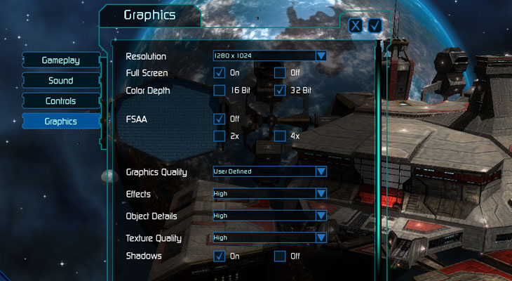
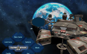
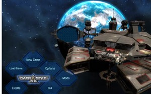
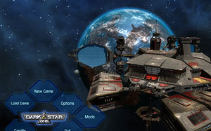
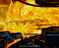
The difference between the graphical detail is quite vast, here are the three standard graphical settings (click to enlarge):
Without shadows, as in the first picture, the game looks really lifeless - shadows are important in space, as they make it feel like a 3D world rather than pasted together pictures. The texture details are particularly nice on the highest setting, having a huge impact on the look of planets and other ships. I wasn't too sure about the textures on the trade station though, they reminded me a little of the original Half Life buildings.
Effects, when turned up, offer a nice extra; I particularly enjoyed seeing the fiery explosions of my enemies just before whizzing through their burning debris. The trails left by all the various ships is also a good effect, leaving behind them a vibrant colour depending on their alliance. Turning objects on and off didn't reall improve my visual experience, however it did have an effect on the FPS which we explore on the next page...

MSI MPG Velox 100R Chassis Review
October 14 2021 | 15:04




Want to comment? Please log in.