
Dead Space Graphics Analysis
Next we take a look at the most superficial but satisfying level of gaming – the graphics.Dead Space is a very pretty game on a technical front, though the dim environments and rotting flesh at every turn may make you think differently. Right from the start the game hammers a few wows into your mouth as the viewscreen opens and you see the Ishimura Planetbreaker for the first time.
That said, just because we think the game is good looking doesn’t mean it will be like that for everyone – that’s one of the drawbacks of having an unfixed platform for a game. Below, we show you exactly what the different settings in the game look like so you can judge it for yourself.
Graphical Presets
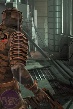
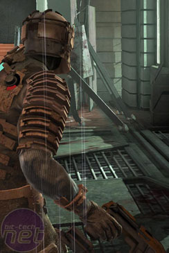
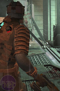
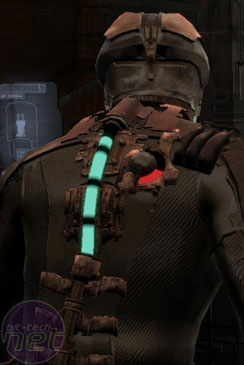
First, we look at the presets which are built into the game engine. These should scale the graphics settings up and down to provide a rough guide for the games visuals and they come in three flavours; High, Medium and Low. Check out the pictures below.The difference then is most notable on the shadows and amount of detail visible on Isaac’s RIG suit. On the High setting the game is well-shaded, detailed and smooth. There are no visible jaggies on the edges of shadows, the RIG suit is almost cluttered with crispness and everything looks good. This is also true for the Medium setting, where the game looks pretty similar except for a reduction in shadow quality.
On Low however, everything changes. The RIG suit changes to look more like it’s made out of smooth plastic than reinforced, coarse fibres and the world around Isaac is stripped of depth and shadows. The texture quality is crippled and the game looks worse for it – so we recommend avoiding this setting.
Shader Quality
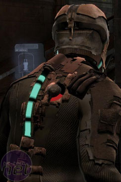
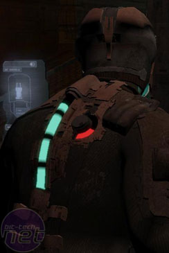
Next up, the shaders. Shaders are an extensively used tool in the programmers' arsenal these days and can be used for all sorts of things. They can add filters to the game to give it a certain visual style, as Mass Effect does with the film grain effect.As it is, the Shader Quality setting as it’s used in Dead Space seems to alter the way that light is filtered in the game. This can be seen by the differences in the three screenshots, though which one is to be considered the best looking is more a matter of personal opinion than anything else.
In the High screenshots, the world is lit realistically. Shadows are detailed, the distance is dim and the close-up items in the game world are shaded just as you’d expect.
The Medium and Low quality screenshots however actually reduce not just the way the light falls, but also apparently the amount of light. Looking at the enlarged pictures, it’s Isaac who is noticeably gloomier than in the High screenshots. The game world doesn’t look any worse off either, so while it is a matter of personal preference we will say that the Low setting looks the creepiest.

MSI MPG Velox 100R Chassis Review
October 14 2021 | 15:04



Want to comment? Please log in.