
Graphics
We’ll be honest, the graphics in Lord of the Rings: Conquest aren’t great. There’s a desperate need for anti-aliasing above all else, blocky characters and the distant armies and siege engines that grind towards the player on some of the levels use suspiciously synced animations.Granted though, most of the graphical drawbacks of the game have doubtlessly been made in order to give the game a wider audience and to ensure that it runs well in multiplayer, which we’ll discuss shortly.
On the other hand though; just because it’s ugly for a good reason, doesn’t mean that it looks any better.
The graphics options in Lord of the Rings: Conquest are quite extensive and we pick through some of the most important-sounding ones below – though as you’ll quickly see, the differences are pretty negligible.
Model Detail
Theoretically Model Detail should massively change how the game looks, making the player character and his enemies appear more or less detailed. The setting comes in High, Medium and Low flavours and you can check the pics below.Spot the difference? Yeah, us neither. The models on each setting look largely similar, to the point of being identical, once you ignore the slight variations in pose. The texture detail, the amount of polygons and so on - all of them are pretty much the same. This is the player character we're looking at, mainly because it's easiest to replicate the screenshot with, but the same holds true for other characters too.
Unfortunately, even on High detail the models don’t look that great – more jagged around the edges than a breadknife and clumpier than a bad Eddie Murphy movie. The effect would be slightly diminished when there are a lot of characters on screen but, as we said before, the battles never get all that crowded – though small arenas can be deceiving.
Shadow Quality
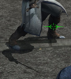
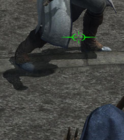
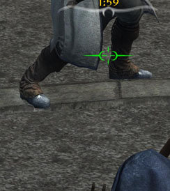
Shadow Quality is a pretty self-explanatory setting and it also, like all the settings we look at, comes with three variations; High, Medium and Low.This difference here is fairly obvious too. On the High Shadow Quality setting the shadows are both dynamic and total – everything (on the characters at least) casts a shadow. Switch down to Medium quality and the shadow is cast only on the character, not certain items – notice that the sword is missing. On Low Quality, all shadows disappear.
That said, while saying that a shadow is both dynamic and total sounds impressive enough, the shadows in Lord of the Rings: Conquest are anything but. At first, to a cursory glance, they may seem passable enough, but as time goes on they rapidly disappoint.
There’s little in the way of dynamic shadows on the environment and what there is tends to flicker and fluctuate more than my mood does when I forget my medication. It’s also worth pointing out that even on the highest settings the shadows are still rough and blocky around the edge, greatly decreasing their impact.

MSI MPG Velox 100R Chassis Review
October 14 2021 | 15:04



Want to comment? Please log in.