Texture Detail
Texture detail is one of the more important factors in a game. It's often worth sacrificing draw distance to notch up the detail a little. After all, which would you prefer; lots of rubbish, blurry stuff or a handful of crisp ones?Texture detail doesn't just affect the background, environmental textures in Lord of the Rings Online either, but affects all game textures. Armour, trees, characters and surfaces – dropping the texture detail too low will make all of them appear blurrier in one fell swoop.
Because texture detail affects so many of the on screen objects, as well as the environment, it's often worth scaling back other features, like shadows, to give you a little more processing power to beef up the texture detail with.
Again, texture detail comes in a number of different flavours. We'll be examining the low, medium and high settings and seeing what effect they have on the games overall appearance.
First off we'll compare the low and medium settings.
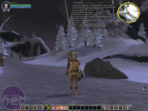
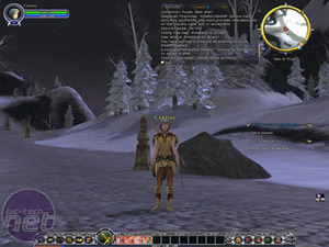
To be frank, on low settings the game doesn't look at all good. The ground looks like the type of grey goo you'd expect to find in a Michael Crichton novel and the armour and road pillars (what are they for anyway?) all have dramatically decreased detail. On the medium setting things look a lot better. It's not perfect, but it's easily passable for an MMO and we wouldn't have minded if that was as good as it got, but it wasn't.
On high texture detail things look even crisper. Colours are clearly defined and the cobblestones all stand out nicely. As ever, this is what the game looks like at its best and is what gamers should aim for, but there's definitely no problem with the image quality on medium and, if you'd prefer to see a little more of the more blurry, then there's nothing wrong with staying on medium detail and pushing the draw distances up a bit.
Landscape Shadows
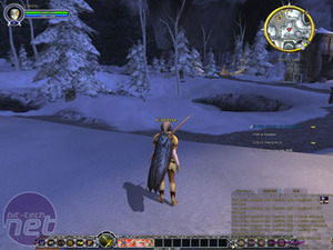
The landscape shadows section handles the shows of the environment. Trees, rocks – all that type of stuff that we desk dwellers never get to see in real life. There were three settings we looked at on landscape shadows; Off, Medium and High.To be honest, the environment of Middle Earth is so clustered with loving detail that if you weren't looking for it then you wouldn't know that the landscape shadows were off in the first picture. On Medium though the shadows are back, not with a vengeance but perhaps with a minor attitude problem.
On the medium setting the shadows look a little blocky, though they do retain the right shape. In our opinion, if you were having troubles with the shadows then you may as well turn them off completely rather than cope with the Lego-like assembly of the medium shadows.
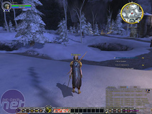
Ah, now this is more like it! Suddenly on the high setting the shadows look a little softer and more rounded.
It's difficult though and players will have to decide for themselves how much they want landscape shadows on. We would say that while the high setting is good, the medium setting isn't worth the effort when you could balance it out by turning up something else. High or off, that's the choice as far as we see it.

MSI MPG Velox 100R Chassis Review
October 14 2021 | 15:04






Want to comment? Please log in.