
Graphics
Given the astonishingly lacklustre reception we gave to all forms of locomotion in Dragon Rising it’s of little surprise that our preferred method of movement in the game was the teaspoon. For those not in the know, that’s when you take a nearby teaspoon (preferably after guilt-tripping someone into making you a cuppa) and jam it into your keyboard so that it holds the W key down.Hey, presto! Teaspooning – the easiest method to make long treks over Skira without being shot down or being confined to the AI policed roads. It sounds like an exploit – it is an exploit – but it also feels like something the game forces you into at times. Helicopters get spotted easily, while offroading isn't a good idea in the jelly-'obiles and boats are few and far between. Hiking is the safest way to travel, even though you’re often hiking to objectives kilometres away.
The advantage of the teaspoon method though is that it gives you plenty of time to take in the sights and appreciate the graphical splendour of Operation Flashpoint: Dragon Rising. It really is a very pretty game in places – though the important bit of the sentence is the last bit; ‘in places’.
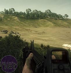
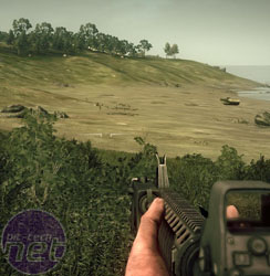
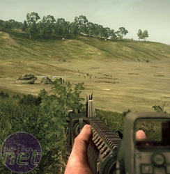
Operation Flashpoint: Dragon Rising on High, Medium and Low graphic presets (L to R), click to enlarge
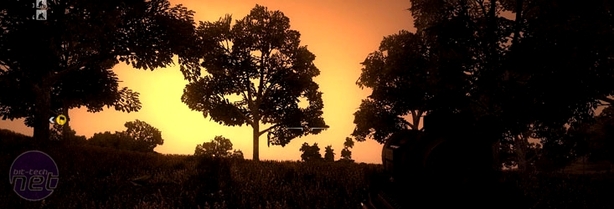
Parts of the game, especially the lighting system and view distance, are fantastic and the designers have clearly tried to play these elements up by setting missions on hillsides and at different times of day. Other parts of the game, such as the actual textures and environments, show a lesser level of attention. In various places we pinpointed rocks and trees that were floating above the ground or textures that didn’t align – hardly game-shattering stuff, but definitely noticeable.
What’s really interesting about the game though is how standardised the graphics have become across the settings and that, while Operation Flashpoint: Dragon Rising provides a bunch of different graphical tweaks, they actually have a fairly minimal impact from what we could see.
We’ve included a bunch of screenshots based on the available presets so that you can check for yourselves, but it seems that the game maintains most of its visual fidelity no matter what settings you use. It’s hard to make that claim so flatly when you bear in mind how the massive the map is and how the campaign cycles through different light environments, but there you go.
The good news is that it also means that the performance of the game is fairly predictable and solid too. Our main gaming rig runs a 2.93GHz Core 2 Duo X6800, 3.25GB of accessible RAM and a Nvidia GeForce GTX 280 and it managed the game just fine on the highest settings, holding things at an average of 50 fps. Even older cars are up to the challenge though and when Richard dropped in for a quick co-op mission then he still managed to run the game on those settings (with 2x AA) with 40+ fps on an Nvidia GeForce 8800 Ultra.
Much of this graphics standardisation and optimisation has inevitably come from the fact that the game has been optimised for consoles. No matter what your feelings are about consolification and the game in general though, it’s good to see a game that runs so well on older hardware.
Likewise, the more technically minded fans will be pleased to know that the game includes a comprehensive mission editor as well, with which you can create your own objectives and campaigns. We had a quick look at it and, to be honest, we couldn’t make head nor tail of it – but it's not usual to bundle editor documentation with review samples.
No matter how complex it looks though, the fact that it’s there ensures there’ll be some sort of user-generated content built around the game at some point – which is never a bad thing.

MSI MPG Velox 100R Chassis Review
October 14 2021 | 15:04



Want to comment? Please log in.