
Colour Correction:
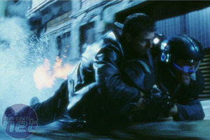
Colour correction has been used in films for a long time now. Essentially, it involves the altering of colour balance of a sequence (or entire film) in post-production. This used to be achieved by applying a chemical treatment to the film stock, but thanks to the wonders of modern technology, it is now possible for directors to mess around with ideas digitally without permanently altering the original footage.The blue Spielberg hues of Minority Report invoke a feeling of a cold, isolating futurescape, while the bright, saturated colours of the Jet Li film, Hero, are used by the director Yimou Zhang to reflect the emotions felt by the characters at the time. Other films, such as Sin City and Sky Captain and the World of Tomorrow employ heavy colour correction to drastically alter the appearance of the film, achieving a comic book-like look & feel.
The colour correcting is used for different reasons in each of the movies we've listed, but the general reason behind them all is the emitional ties that colour has with the human psyche. It's extensively used in many visual arts to exaggerate feelings or emotions that are trying to be conveyed in the content. The same is true for games, but you can go much, much further with colour correction in games.
There are some limitations to using colour correction in games, due to their dynamic nature. Having said that, there are also many advantages to using the technique. Using colour correction can enhance the features in the world, draw attention to a part of the level or even reinforce a feeling, such as suspense or fear.
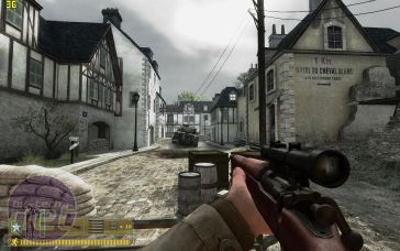
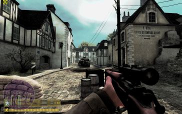
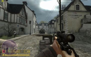
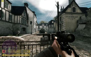
It is also invaluable for re-using content over and over, as you can apply game, level or even event specific looks to a particular part of a level using colour correction. A classic example of this are the screenshots below. They show how it is possible to re-use the same textures and scenery with a mere colour correction.
Day as Night and High Contrast:
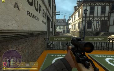
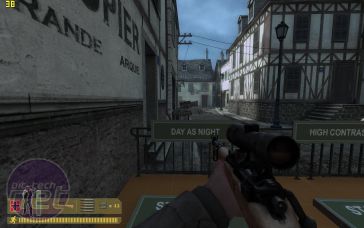
(reference image, partial Day as Night)
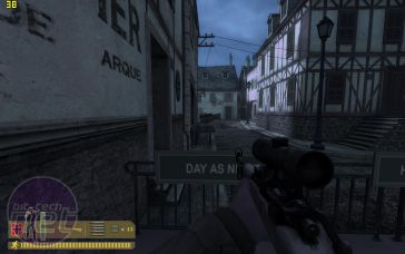
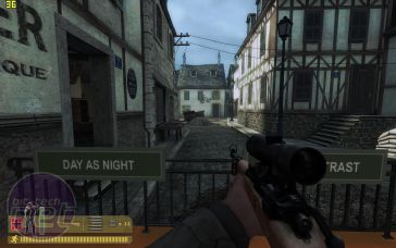
(full Day as Night, Day as Night & High Contrast hybrid)
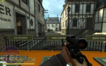
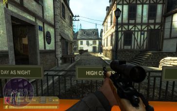
(partial High Contrast, full High Contrast)
Sepia and Black & White:
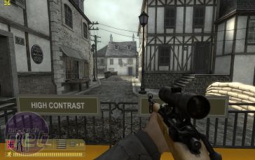
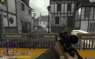
(High Contrast and Sepia hybrid, partial Sepia)
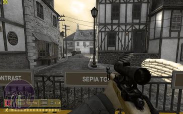
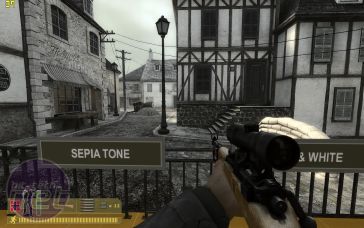
(full Sepia, Sepia and Black & White hybrid)
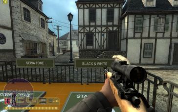
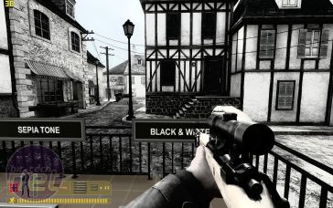
(partial Black & White, full Black & White)
There are some dramatic differences between the preset modes, but the engine is not limited to just these modes. Valve has implemented a set of tools that are similar to messing with the colour replacement tools inside Adobe Photoshop - if you're familiar with that, you'd have no problems creating your own colour replacement profiles. We've included some quick mockups below.
I'm a self confessed Photoshop rookie so they're not brilliant, but they should give you an idea of what is possible. If you adjust the colours too far, you're greeted with visual artifacts - that's a limitation of the visible colour range, rather than anything abnormal going on. Valve's content artists should be able to come up with some absolutely fantastic effects using Colour Replacement. These should help increase the mood and immersiveness of the game - I can't wait to play Avalanche in the dark!

MSI MPG Velox 100R Chassis Review
October 14 2021 | 15:04




Want to comment? Please log in.