Shadows
Shadows can be one of the most important parts of some titles. Games like F.E.A.R build entire levels around the use of shadows, turning them into a critical facet of the gameplay. Shadows can provide a chance for a monster to leap out unsuspectingly, or a chance for a player to stealth-it-up and silently take down a baddie in true Sam Fisher style.It’s odd then that Spider-Man 3 doesn’t allow the advanced shadow tweaking to which we’ve become accustomed. There’s no chance to use soft shadows for example and players are left with two options; shadows on or shadows off.
Unfortunately, the choice is a bit of an illusion and players should really be given the following choice; Ugly square black lumps on, or game lacking in now standard aspect of gameplay.
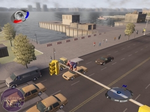
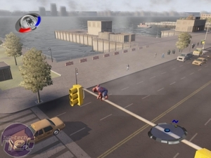
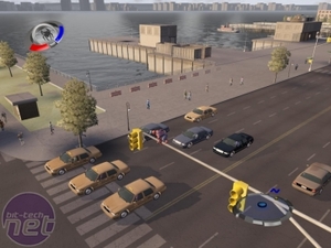
As can be seen in the screenshots, the game looks worse with shadows on than it does with shadows off. The silhouettes cast by car is so blocky that Mario would want to smack his head on it to see if there are any coins inside. Sadly there aren’t any, it’s just layer after layer of ugly black lumps.
Keeping shadows off will probably save a few frames per second and, though the game will look a little too bright most of the time, at least it won’t be blanketed in black squares. Do yourself a favour and leave the shadows off.
City detail
Given that Spider-Man is a city dwelling superhero, as most of them are, and that Spider-Man 3 is set pretty much only in Manhattan, you’d think that a fair level of attention would go into designing the various city blocks around which everybody’s favourite neighbourhood Spider-Man patrols.You’d be wrong.
The city in Spider-Man 3 is woefully lacking in detail, with most buildings being square lumps with simple textures slapped on the side. Instead, the city detail option seems to affect the view distance and the visible city on the sky line.
Low / Medium
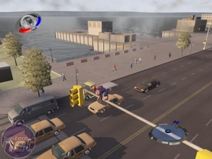
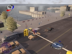
Low city detail doesn’t look too bad until you scale it up an realise how much has been cut out at this low level of detail. Bumping up to the medium setting doesn’t require too much more computing power and gives a decent amount of extra detail. The boat in the water and the pier next to it are both bought on by improving the city detail. The ugly lump on the horizon still remains, but pushing up to high detail takes care of that.Medium / High
On high detail the bland and blank horizon changes to a more fitting distant cityscape. It’s not very high detail and it isn’t animated, but it looks better for being there and makes the game environment feel a bit busier and city like. Again, if your computer can handle going up to high-detail then it’s going to give you a better playtime if you do so.

MSI MPG Velox 100R Chassis Review
October 14 2021 | 15:04






Want to comment? Please log in.