
The Alamo
As part of the development of the game, the Empire team at Petroglyph originally evaluated two third-party graphics engines. "Though architected very well, neither gave us the specific rendering power that was required for the game," said Petroglyph president and lead programmer in his Designer Diary."To satisfy our high requirements, we wrote our own proprietary Alamo graphics engine. When implemented, Alamo quickly proved to look stunning and perform solidly. The new graphics engine would allow Empire at War to play well and look good on lower-end systems, while also looking amazing with a full DirectX 9 feature set on high-end systems."
Having evaluated the gameplay elements, the second part of our review will examine the finer points of the bespoke Alamo engine.
Graphics details
From the in-game menu there are four main settings to control Detail using a slider bar from "Low" to "High", but for the ease of discussion, we will call these Low, Medium, High and Maximum.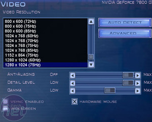
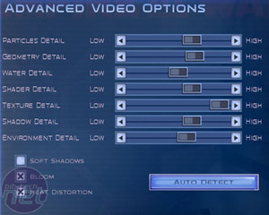
Each present controls no fewer than seven individual variables hidden under Advanced Options. This allows you to fine-tune the detail bias for Particles, Geometry, Water, Shaders, Textures, Shadows and Environment. For now, let's examine the major changes for each preset.
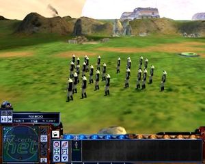
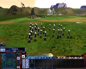
(left) Low Detail. (right) Medium Detail
If your PC is close to the minimum system requirements on the box - 1GHz processor, 256MB RAM and 32MB graphics with hardware T&L (that's Radeon 7200 or GeForce 256 and above) - then this is what the game is going to look like. Seriously low-resolution textures, simple unit geometry and more basic environmental detail. Moving up to Medium detail improves things a little: texture detail moves up a notch but other than being fully 3D Spinny Rotatey, the game will still look pretty dated.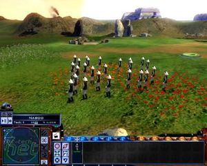
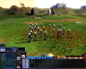
(left) High Detail. (right) Maximum Detail
High Detail and now we're cooking. Texture detail takes a big jump, adding much needed detail to grass, gravel, rock and snow. Foliage is a welcome addition, brightening up the fields of Naboo with lengthy grass and wildflowers; Kashyyk is covered with dense ferns. Static environmental shadowing also appears - seen here on the boulders - which again raises the bar that little bit higher.It doesn't take a rocket scientist to figure out that Maximum Detail is where all the action is. The textures are gorgeous, and with all models at maximum polygon count, the units have the detail to match. Real-time shadows are enabled for all units, as well as the bonus eye-candy detailed on the next page.
The best way to see these changes is to click the thumbnails for a full 1280x1024 screenshot. Flick between all four and you will have no doubt that you'll want to play Empire at War at either High or Maximum detail. Of course, this detail is all well and good up close but this is an RTS game - what difference does all this make zoomed out?
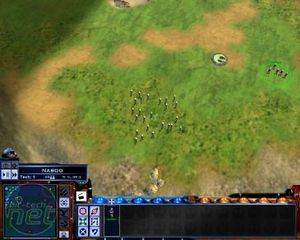
(left) Low Detail. (right) Medium Detail
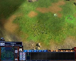
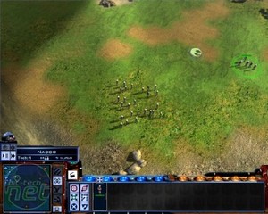
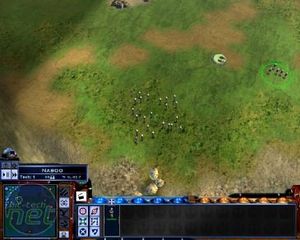
(left) High Detail. (right) Maximum Detail
These screenshots are the same scene as before but taken from the default viewpoint up in the clouds. Again, the best way to see the improvements that Max Detail makes over Low is to click for the 1280x1024 screenshots and flick between them. Texture detail has a big impact, as do Shadows. Whether you want to enable stuff like the foilage is down to whether you use the zoomed in viewpoint much - if you prefer to command from the skies, you might not notice it if disabled.
MSI MPG Velox 100R Chassis Review
October 14 2021 | 15:04



Want to comment? Please log in.