
Graphics Espada
So, now we move into the realms of The Graphical Analysis. Just what do the different graphics settings do for the actual appearance of the game?We had a quick look at the options page for Sword of the New World: Granado Espada, a name which never fails to annoy with its length, and saw though that the graphical tweaking available is actually quite limited. In game, there’s no anti-aliasing settings to fiddle about with or HDR to enable or disable, which is somewhat expected given that the game is an MMO and will therefore focus more on addictive gameplay than graphical l33tness.
Still, the available graphics settings feel a little restrictive even for an MMO and we’re limited to just ‘Glow effect’ (Bloom) toggling and setting the water and texture detail to low, medium or high. There’s an effects detail choice too, but it’s only between low or high and there’s no middle ground to settle on.
For the purpose of simplicity, we’ve reduced the settings somewhat further, with all three settings either on high, medium or low. Check out our comparative screenshots below.
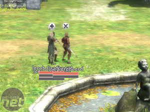
Low Detail
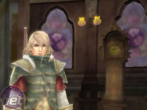
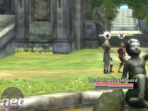
So, the game doesn’t look very good, does it? What you see above is how the game looks with low terrain, texture and water quality.
The texture quality is the option that causes the biggest hit in visual quality and it’s immediately obvious just how detailed the textures are in the higher settings when compared to this. The grass looks like green excrement smeared across your screen and the previously gorgeous baroque dresses (I am a guy, honest) and suits are now reduced to the type of vague blurs we’d be more used to seeing on Sims in the shower.
Really, if you can push the graphical setting up higher than this then please do. If your system is particularly low spec then it’s worth sacrificing water and effects detail to help improve texture detail, which is where all the splendour is being kept.
Medium Detail
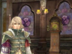
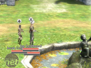
Already everything is starting to look better, though by no means fantastic. It goes to show just what a little texture detail can do for a game, really. Effects detail is still left on low, though water and texture detail have been pushed to medium.
The differences really show up on the close-ups, such as the grandfather clock behind Jack Cardboard in the left hand picture. The improved detail also makes the character look a little better, immediately making the effeminate-looking Jack looking a little better, though his appearance is still blatantly based on eastern traditions of character art.
High detail
Suddenly almost every detail jumps into focus and a comparison of the same grandfather clock illustrates exactly how much better the game looks on its highest settings. Details shine into view thanks to the well done textures and it’s obvious that this really is what gamers should be aiming for as it didn’t have a performance impact which we could detect on our system and it helps to make an otherwise bland game look really quite appealing.

MSI MPG Velox 100R Chassis Review
October 14 2021 | 15:04




Want to comment? Please log in.