
Graphics
The graphics in Universe At War: Earth Assault, as you can clearly see from the screenshots throughout the article, are a bit of a mixed bag.Sometimes, the graphics look lush and nicely put together – there are no jagged edges and the large explosions and missiles certainly look compelling if not realistic. However, at the same time, the lip-sync of characters, which you obviously can’t see in these pictures, is very poor and the overall quality of the cutscenes is a bit low too.
The game proved to be quite CPU-intensive too and when we had lots of units on screen at maximum detail then the framerate dropped noticeably.
Either way, we’ve put together a little guide here to show you the effect of the settings which had the most noticeable effect on how the game looked. Universe at War is never going to look great, but you can at least stop it from looking bad or let yourself know what you're in for.
Texture Detail
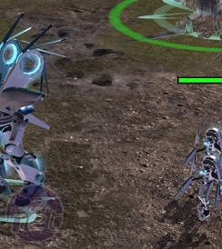
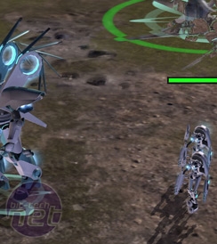
There are only a few real graphical settings of note in Universe at War: Earth Assault and the one which has the most massive visual impact is the Texture Detail.Alterable via a slider, this setting controls the amount of extra layers and crispness of all textures in the game, but is most noticeable when it comes to the large, flat textures of the environments. Take a look at the screenshots below.
As you can see, the quality of the texture is wildly scalable and ranges from the sharp detail of the High setting down to the vomit-like smudges of the Low setting – it's almost as if it's just adjusting the level of anisotropic filtering, but the textures are also slightly lower-resolution too. We didn’t notice this setting causing any particular performance hit on its own, so we’d suggest putting it on high if you've got a graphics card with enough onboard memory to handle it.
It’s also worth pointing out that this setting doesn’t seem to heavily impact the textures of units and buildings and had minimal effect on the global map too.
Shadow Detail
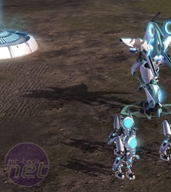
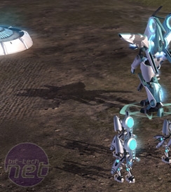
Shadow Detail too comes in three flavours and is controlled via a slider in the advanced graphics options. This little sub-menu is where all the interesting graphics options are located, though there are only two or three which are hugely important. If you’re interested in an overall better look to the game, Shadow Detail is one of them.So, the difference in quality between the High and Low detail shadows is immediately noticeable – mainly because the Low setting turns Shadows off completely. The difference between High and Medium is harder to spot, but in-game it proved to be easier to see and the shadows were all a lower resolution and a little less crisp on the Medium setting.
To me, there’s no middle ground here though. Either you want the shadows on or you don’t because of performance problems. If you want the shadows on then you turn them on full and appreciate the extra depth afforded to a battlefield by them. If not, you turn them off completely. Having crappy shadows on screen all the time is something nobody wants.
Environment Detail
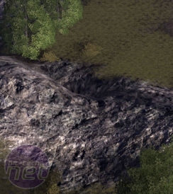
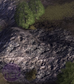
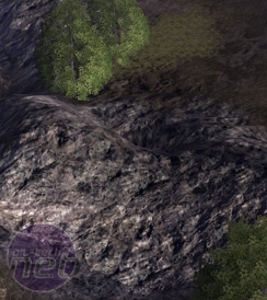
The final setting which we thought had a profound effect on the graphical fidelity of the game was the Environmental Detail setting.This setting is on a slider just like the others, but is a bit ambiguously named. It could mean anything from the number of trees to the complexity of the mountains, the number of craters on a battlefield or whether the grass sways or not. Check out the pictures below to see what it actually does.
It’s hard to spot at first, but if you look in the top right corner of the pictures you’ll spot the tell-tale disappearing grass. This seems to be the main manifestation of this setting.
On High settings the grass is more plentiful and lush – levels seem to have more depth, even if the graphics on the grass aren’t jaw-dropping. On the lower levels the grass is increasingly limited. The fact that the grass doesn’t look too good on its own means that this setting is more a matter of preference than much else – personally, I prefer it on medium. What about you?

MSI MPG Velox 100R Chassis Review
October 14 2021 | 15:04





Want to comment? Please log in.