
Graphics
Dawn of War is getting on a bit now and we think we can spot some grey hairs around the temples, but it is perhaps still worth taking a look at the graphics of the game and seeing just how well they’ve aged. Before we get down to the actual settings themselves though there are some basic criticisms to level in the direction of Dawn of War and Soulstorm.For one, the view irks us somewhat and the main problem with Dawn of War still holds true – you just can’t ever seem to zoom out enough. The interface also takes up a hefty portion of the screen when it is pulled up into view and there’s no middleground between letting the menus dominate the battlefield and relying solely on the keyboard.
It also has to be said that Soulstorm doesn’t seem to have expanded on the engine from Dawn of War at all – so those of you hoping for increased view distances and improved textures will be sorely disappointed. There’s still a gray fog on the skyline and the details are still a bit blurry – which is a shame because hi-res textures should theoretically have been an easy and much needed addition to the game.
Lights
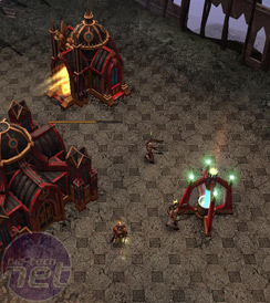
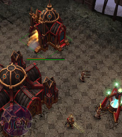
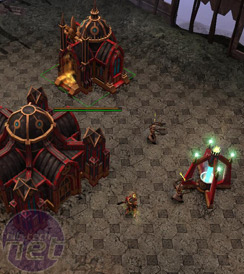
Lighting detail is the first graphical option we decided to look at, mainly because the graphical tweaking possible in the main menu is so massively limited. There really is only a handful of options to fiddle with.Honestly, we can’t spot a single difference in lighting quality or quantity here. There is subtle difference in the light coming from the
So, with no real noticeable change across the three settings and no real explanation of the setting provided in the game it is a bit hard to make a recommendation about lighting in Soulstorm. I guess if you hit any performance issues then you should turn this setting down, but otherwise don’t worry about it.
Unit Occlusion
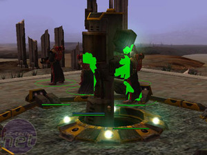
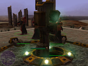
Unit occlusion is a setting that affects both gameplay and graphics and it comes in two flavours – on and off. Check the screenshots below, followed by an explanation.See those green marks on the left-hand picture? That isn’t an error and it isn’t where your dog sneezed on the screen – that’s unit occlusion. It basically highlights any units you have who would otherwise be hidden behind buildings or terrain.
Unit occlusion itself is pretty useful as a gameplay tweak given the unit cap that stops you creating massive armies. If you’ve got your builders spread out over the map building Listening Posts then this setting will stop you having to recall them all by highlighting the one you lost behind your

MSI MPG Velox 100R Chassis Review
October 14 2021 | 15:04



Want to comment? Please log in.