By now, we know that many of you are au fait with the uber-browser, Firefox. Over 60% of bit-tech's readers are now logging on with Open Sauce browsing technology, and happily avoiding the security issues, bugs and inflexibility of Internet Explorer 6.
However, did you know that there's a new version of IE on the horizon? IE7 ships with Windows Vista, and it's a substantial upgrade to the current deadbeat version that ships with XP.
That's all very well, but can even a substantial upgrade compete with the joys of the Fireferret? It's an important question, since it just so happens that there's a new version of that out too - Beta Candidate 1 of FireFox version 2.0 makes some updates to the current version, 1.5.
So which is the best beta browser? Come the end of the year, when both of these should be available, which should you plump for? We're here to examine the differences between the two and come to some summary conclusions. We tested both the new browsers on the latest beta of Windows Vista.
Read on...
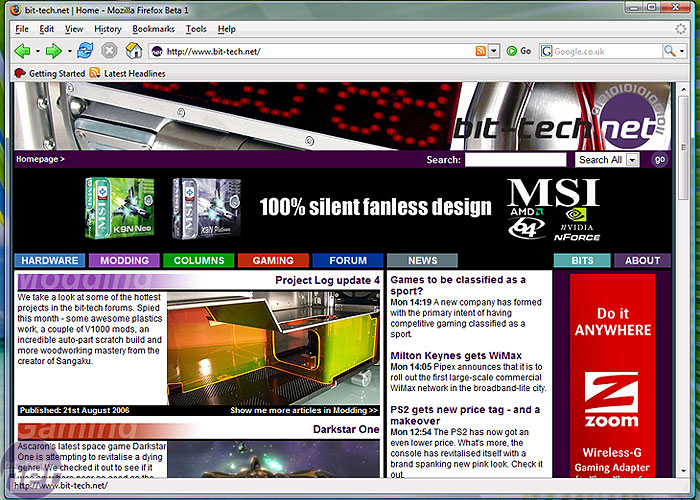
Firefox 2: There really aren't any jarring differences that will make you think - "Wow, this is cool." In fact, you might be forgiven for thinking that you'd started up 1.5, so minor is the change.
 Can you honestly see a difference between this and Firefox 1.5? (Well, aside from the Vista niceties). There's little to write home about here - but then, the Firefox interface has always been rather nice.
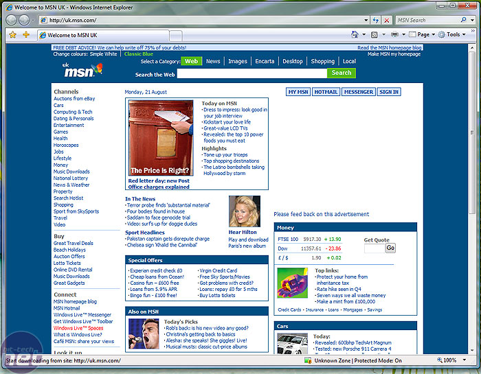
Internet Explorer 7: Moving on to IE7, the differences are massive. Where shall we start?
 Let's start with the top bar. Gone is refresh, home, print etc on the left and in their place are just the back and forward buttons. The URL bar is extended, and refresh and stop are now mini-buttons next to it. To the right of those is the all-new search box, which acts almost exactly like the one in Firefox.
Favourites tools are on the bar beneath along with - get this - tabs; open, by default, when you load up the browser. There's a mini-toolbar to the right of this, with tools for RSS, printing and page layout.
What you'll notice is the lack of menu bar. Most things that were in the menu bar are now on the Tools dropdown, but since most people really only use the buttons presented in front of them, this makes for a convenient way to save space.
The layout is an odd mixture of clean and simple (the left hand side) and small and cluttered (the right hand side, with all those arrows). It's definitely an improvement on IE6, and wins points over Firefox for showing tabs by default.
However, did you know that there's a new version of IE on the horizon? IE7 ships with Windows Vista, and it's a substantial upgrade to the current deadbeat version that ships with XP.
That's all very well, but can even a substantial upgrade compete with the joys of the Fireferret? It's an important question, since it just so happens that there's a new version of that out too - Beta Candidate 1 of FireFox version 2.0 makes some updates to the current version, 1.5.
So which is the best beta browser? Come the end of the year, when both of these should be available, which should you plump for? We're here to examine the differences between the two and come to some summary conclusions. We tested both the new browsers on the latest beta of Windows Vista.
Read on...
Interface
Firefox looks substantially the same in version 2.0.Firefox 2: There really aren't any jarring differences that will make you think - "Wow, this is cool." In fact, you might be forgiven for thinking that you'd started up 1.5, so minor is the change.

Internet Explorer 7: Moving on to IE7, the differences are massive. Where shall we start?

Favourites tools are on the bar beneath along with - get this - tabs; open, by default, when you load up the browser. There's a mini-toolbar to the right of this, with tools for RSS, printing and page layout.
What you'll notice is the lack of menu bar. Most things that were in the menu bar are now on the Tools dropdown, but since most people really only use the buttons presented in front of them, this makes for a convenient way to save space.
The layout is an odd mixture of clean and simple (the left hand side) and small and cluttered (the right hand side, with all those arrows). It's definitely an improvement on IE6, and wins points over Firefox for showing tabs by default.

MSI MPG Velox 100R Chassis Review
October 14 2021 | 15:04


Want to comment? Please log in.