

Catches thieves just like flies
Having completed the right side panel, it was time to move on to the top of the case. This is a smaller area, and with the main Spiderman character already used, I thought I would try and find a cool looking spider to continue the theme.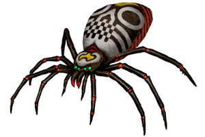
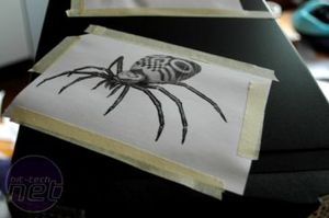
Yet more Google Image Search and voilà: one mean-looking spider. As before, I printed the artwork on plain A4 paper and taped it in place ready for outlining.
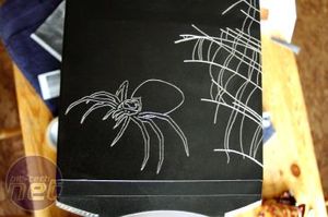
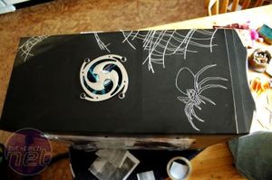
This is what the basic outlined looked like. I added some webbing freehand - it's simple enough to just draw with your eye rather the specifically requiring source artwork.
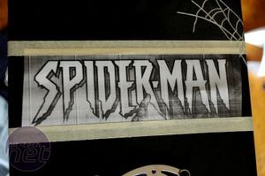
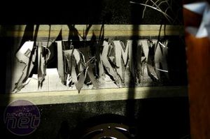
No themed case would be complete without a logo, and I was blessed with a really cool Spiderman logo on the JPG I used for the side panel. You know the method by now: print; tape; trace. Here you can see a "good" example of how your paper template can shred as you work on it. Eventually it gets so bad that you have no choice but to remove the lot and go freehand.
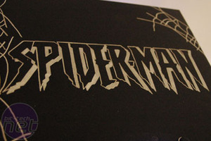
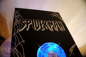
Here you can see the advantage of having clean lines and simple, monochrome artwork: the engraved logo is an exact replica of the original. Again, it's hard to appreciate the result using photographs, but it looks really cool in person.
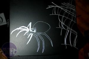
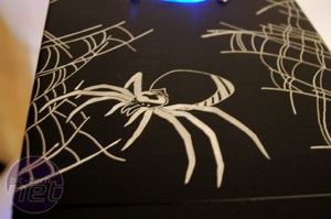
The final touch for the top of the case is to fill in the spider. Happily, that didn't take too long.
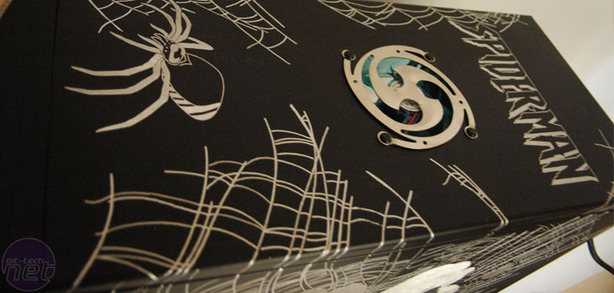
Here is the overall view. If you look carefully along the bottom, you can see where I was able to blend the spider web from the right panel up and over onto the top. This creates the illusion that it is all one piece of work rather than individual panels.

MSI MPG Velox 100R Chassis Review
October 14 2021 | 15:04



Want to comment? Please log in.