
So, after taking the unsuspecting machine from its cosy nest, it was time to give it some power and start it up for the first time.
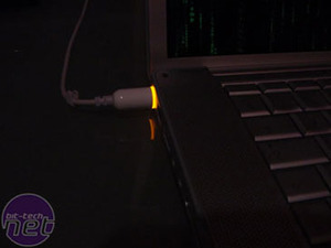
Juicing...
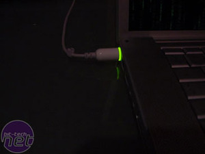
Juiced!
Charging indicator on the laptop? That’s so last millennium, daahrliing… The ring on the power jack glows amber when the battery is charging, and green once it’s fully charged.
The battery was about 75% full from the factory, so this initial charge didn\'t take long. The battery is like those in most modern laptops, in that it\'s \'smart\' and can report power usage and power remaining to the OS. For it to work properly though, you do need to calibrate it by charging it up to full, and then running it flat and finally charging it up to full again.
Upon hitting the power button for the first time OSX does the normal OS setup thing of asking you for a series of details so it can set up user accounts and log onto the network – Just like windows. Nothing difficult there. Once in, I got to see OSX in all its glory. And this is where the fun started, as whilst they say making the switch is easy, if you’re old (check), set in your ways (erm… check) and have been Microsoft’s slave for the past 16 years (that’s all three then) it’s not as easy as you expect. Not because it’s difficult, but because nothings quite where you’d expect it to be.
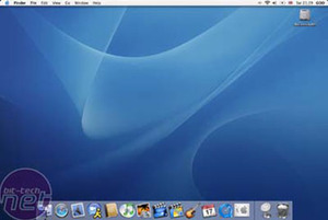
What, no rolling hills?
Here’s the OSX desktop – along the bottom we have the most noticeable item there - the ‘dock’. This is best explained as a combination of XP’s taskbar and quick launch area. Applications that are running appear on this bar, and whilst the app is loading, its icon bounces jauntily up and down to let you know it’s there.

Dock horror!
But you can also drag Icons onto the dock, and they stay there like a shortcut to the application it represents. The line on the dock separates applications from files – anything to the right of it is a file or document of some sort (The \"thing on a spring\" is a shortcut to the Apple website), with the exception of the waste paper bin. Minimized windows appear here as well, as a miniature version of themselves. You can actually recognize what’s app it is, as it\'s an exact tiny replica!
The dock also serves as a means for an application that doesn’t have focus to get your attention if it needs it – by having it\'s icon jump up and down until you see what it wants. The dock is also completely configurable – size, number of icons and which icons are up to you.
The second most noticeable thing about the desktop is what I feel (as a dyed in the wool Windows user) is the oddest thing to get to grips with. The menu bar. It sits along the top of the screen; to the right we have the date and time, who’s logged on (if you have fast user switching on) and indicators for battery state, locale, volume, WiFi signal strength and Bluetooth.

Statuses or Stati?
To the left are a bunch of menus, starting with the Apple logo. All of these (bar the Apple) are application dependant – that is, depending on which application has a window that is currently topmost on the desktop.

Ummm, menus...
And this is what is catching me out 9 times out of 10. In XP, the menus for any given application are along the top of its window. In OSX, it isn’t – it’s at the top of the screen. So for the past week or so I’ve been trying to get to grips with this. It’s only a little thing, but it does slow me down. It does helpfully tell you what application the menu bar is currently handling though - as the menu in bold type is always the name of the app in question. I guess we’ll see in the coming weeks if an old dog can be taught new tricks – or at least to look at the top of the screen for the menus…
The Apple menu can be thought of as OSX’s start menu, but it doesn’t display installed applications like in XP. But it does do pretty much everything else the start menu does, like giving you options to quit and shutdown, hibernate the machine (or sleep as Apple call it), check for software updates and open recently viewed files.
The last couple of things to talk about on this improptu whistle stop, noobie tour (Run by an OSX Noob, for OSX Noobs!) of the Mac desktop are the Finder, and Expose.
The finder is a combination of ‘My Computer’ and ‘Network Neighbourhood’. In here you can browse the network for shared drives, navigate your way round the hard drive, install and launch apps.
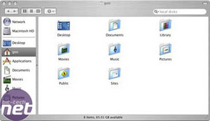
Finders keepers
Just like in Windows, there are links to different directories / folders, the Users home area, and shortcuts (or aliases in Mac parlance) to standard directories such as applications, music movies etc, which hold exactly what it says on the tin. The finder also displays any mounted drives (network or otherwise) which can unmounted by clicking on the eject button next to the icon.
Expose is a neat way of handling open windows. When you’ve got a ton of windows open, it can be difficult to find a particular one in the stack. Expose allows you to allocate a couple of f-keys to navigate through the mess. One key shrinks all open windows in size until they all fit on the desktop. Waving the cursor over these mini windows displays the name.
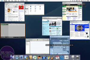
It\'s exposing itself!
Once you’ve located the window you want, clicking on it selects it, and returns it and all the other windows to their original sizes. Hitting another key does the same thing, but only minimizes the windows of the currently active application
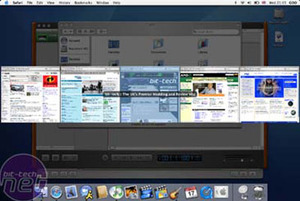
And again!
A third allocatable key moves all the windows to the edges of the desktop, allowing you to get to any icons sat on it that where covered over. In all cases, another tap of the key brings the windows back to normal. It doesn’t sound a lot, but in practice it’s very useful, and extremely easy to use.
Anyway, I think that’s enough of a tour for now. Let me tell you how I got this puppy to talk Windowese and settle into GOONet.

Juicing...

Juiced!
Charging indicator on the laptop? That’s so last millennium, daahrliing… The ring on the power jack glows amber when the battery is charging, and green once it’s fully charged.
The battery was about 75% full from the factory, so this initial charge didn\'t take long. The battery is like those in most modern laptops, in that it\'s \'smart\' and can report power usage and power remaining to the OS. For it to work properly though, you do need to calibrate it by charging it up to full, and then running it flat and finally charging it up to full again.
Upon hitting the power button for the first time OSX does the normal OS setup thing of asking you for a series of details so it can set up user accounts and log onto the network – Just like windows. Nothing difficult there. Once in, I got to see OSX in all its glory. And this is where the fun started, as whilst they say making the switch is easy, if you’re old (check), set in your ways (erm… check) and have been Microsoft’s slave for the past 16 years (that’s all three then) it’s not as easy as you expect. Not because it’s difficult, but because nothings quite where you’d expect it to be.

What, no rolling hills?
Here’s the OSX desktop – along the bottom we have the most noticeable item there - the ‘dock’. This is best explained as a combination of XP’s taskbar and quick launch area. Applications that are running appear on this bar, and whilst the app is loading, its icon bounces jauntily up and down to let you know it’s there.

Dock horror!
But you can also drag Icons onto the dock, and they stay there like a shortcut to the application it represents. The line on the dock separates applications from files – anything to the right of it is a file or document of some sort (The \"thing on a spring\" is a shortcut to the Apple website), with the exception of the waste paper bin. Minimized windows appear here as well, as a miniature version of themselves. You can actually recognize what’s app it is, as it\'s an exact tiny replica!
The dock also serves as a means for an application that doesn’t have focus to get your attention if it needs it – by having it\'s icon jump up and down until you see what it wants. The dock is also completely configurable – size, number of icons and which icons are up to you.
The second most noticeable thing about the desktop is what I feel (as a dyed in the wool Windows user) is the oddest thing to get to grips with. The menu bar. It sits along the top of the screen; to the right we have the date and time, who’s logged on (if you have fast user switching on) and indicators for battery state, locale, volume, WiFi signal strength and Bluetooth.

Statuses or Stati?
To the left are a bunch of menus, starting with the Apple logo. All of these (bar the Apple) are application dependant – that is, depending on which application has a window that is currently topmost on the desktop.

Ummm, menus...
And this is what is catching me out 9 times out of 10. In XP, the menus for any given application are along the top of its window. In OSX, it isn’t – it’s at the top of the screen. So for the past week or so I’ve been trying to get to grips with this. It’s only a little thing, but it does slow me down. It does helpfully tell you what application the menu bar is currently handling though - as the menu in bold type is always the name of the app in question. I guess we’ll see in the coming weeks if an old dog can be taught new tricks – or at least to look at the top of the screen for the menus…
The Apple menu can be thought of as OSX’s start menu, but it doesn’t display installed applications like in XP. But it does do pretty much everything else the start menu does, like giving you options to quit and shutdown, hibernate the machine (or sleep as Apple call it), check for software updates and open recently viewed files.
The last couple of things to talk about on this improptu whistle stop, noobie tour (Run by an OSX Noob, for OSX Noobs!) of the Mac desktop are the Finder, and Expose.
The finder is a combination of ‘My Computer’ and ‘Network Neighbourhood’. In here you can browse the network for shared drives, navigate your way round the hard drive, install and launch apps.

Finders keepers
Just like in Windows, there are links to different directories / folders, the Users home area, and shortcuts (or aliases in Mac parlance) to standard directories such as applications, music movies etc, which hold exactly what it says on the tin. The finder also displays any mounted drives (network or otherwise) which can unmounted by clicking on the eject button next to the icon.
Expose is a neat way of handling open windows. When you’ve got a ton of windows open, it can be difficult to find a particular one in the stack. Expose allows you to allocate a couple of f-keys to navigate through the mess. One key shrinks all open windows in size until they all fit on the desktop. Waving the cursor over these mini windows displays the name.

It\'s exposing itself!
Once you’ve located the window you want, clicking on it selects it, and returns it and all the other windows to their original sizes. Hitting another key does the same thing, but only minimizes the windows of the currently active application

And again!
A third allocatable key moves all the windows to the edges of the desktop, allowing you to get to any icons sat on it that where covered over. In all cases, another tap of the key brings the windows back to normal. It doesn’t sound a lot, but in practice it’s very useful, and extremely easy to use.
Anyway, I think that’s enough of a tour for now. Let me tell you how I got this puppy to talk Windowese and settle into GOONet.

MSI MPG Velox 100R Chassis Review
October 14 2021 | 15:04


Want to comment? Please log in.