Design
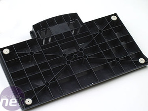
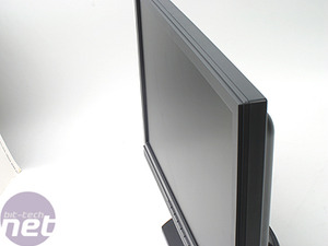
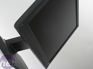
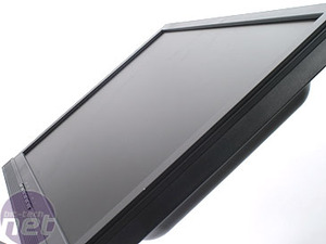
The ProLite E2200WS has a basic, yet inoffensive design. The monitor is made up of two pieces, with the screen easily slotting into a fairly stable stand. The stand however, is fairly limited in what it can do. You can adjust the angle of the screen vertically but there is no side to side movement. The screen does not rotate into portrait mode as others do and there is no way of varying the height at which the screen stands. The bottom of the monitor stands about 4 inches from the desk. This lack of ergonomic adjustment will be a pain for those who like to keep their backs in good shape.The ProLite E2200WS comes in black, with the menu options and Iiyama logo stencilled in a dull white. A thin speaker runs below the six menu buttons that you see on most monitors: options, arrow keys, enter, exit, standby and an auto button. It's fairly discrete, which I appreciate; one thing that bugs me slightly about other monitors is that they give too much space to the buttons underneath the screen or try to make them overly complicated.


The viewing angle for the monitor is satisfactory, not the best of any monitor in the office but far from the worst. It will prove more than adequate for most users.
Overall, the design is solid and efficient. I had no problems setting the monitor up and once in place it was sturdy. The buttons were easy to use even for people with the fattest of fingers and as such I give a (fat) thumbs up to Iiyama for design, with the height adjustment caveat.

MSI MPG Velox 100R Chassis Review
October 14 2021 | 15:04


Want to comment? Please log in.