
Design
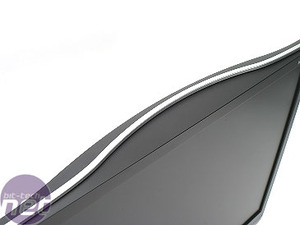
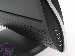
There are lots of nice curves on the display, with the main black body being highlighted with silver accents. The display is thin and sleek. The main menu buttons are on the side of the display, and this means a compromise. Whilst the front of the monitor is designed clean, it means you're always peering around the side to make adjustments.However, this isn't going to be a major problem if you manage to get it set up correctly once and then never change it. Fortunately, the menu system itself - which is a fairly standard affair - is easy to use.
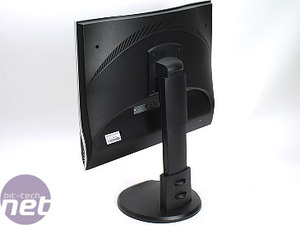
The stand is adjustable - it goes up and down a large amount, meaning you should be able to find a height that works for you. With the big speaker grille at the bottom, the actual display part is perhaps a little higher up, at its lowest height, than we would like, but this is probably nit-picking somewhat.
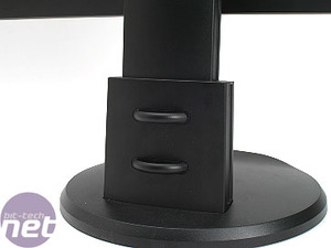
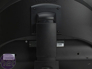
The stand has a couple of ties on the back for routing your cables through, helping you to keep the back of your desk tidy, if that's something that matters to you. Is it really?

MSI MPG Velox 100R Chassis Review
October 14 2021 | 15:04



Want to comment? Please log in.