Apevia X-Telstar Junior
Manufacturer: ApeviaUK Price (as reviewed): £59.00 (inc. VAT)
US Price (as reviewed): $79.99 (ex. Tax)
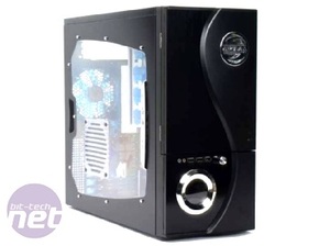
Apevia has been trying to make a name for itself in the budget market lately and as part of that effort it has launched the X-Telstar Junior or, to give it the unnecessarily long full name, the Apevia X-Telstar G-Type Junior (Black). Whatever the name, it’s a steel and plastic chassis for ATX and mATX motherboards which boasts a few nice little features above other cases in the class.
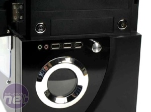
Most notable of these features is the fan controller and temperature monitor duo located on the bezel. The ability to gauge the internal temperature of a system at a glance is, if the Apevia X-QPack 2 (yep, another lame little neologism) is anything to go by, fairly typical of the Apevia designs. It’s an attempt to blur function and form to create something which is useful and stylish.
However, as we found out with the X-QPack 2, that isn’t necessarily an aim that Apevia is always able to meet and has failed at before. Still, everyone deserves a second chance, right? So, let’s have a peek at the X-Telstar Junior and see if living up to its gargantuan name is a good thing or not.
Staying Skin Deep
If I’m going to be really blunt and up front about it (which, obviously, I am) then I’ll just come out and say that the Apevia X-Telstar Junior isn’t really much to look at. It can be quite hard to judge how the case really looks sometimes thanks to some tricky stock photos that make the bezel of the case look like it is crafted from finely polished metal, so I suggest you take a close look at the larger version of our own photos.See? That isn’t metal on the bezel, at least not all of it. It’s actually a meeting of metal and plastic, blended into a wavy line and with silver plastic emblems dotted on each side so that the whole case starts to look like the son of the companion cube and a Chinese spiritualist.
It’s a ying-yang oblong. You’ve got to ask why anybody ever thought that was a good idea (though, the word yoblong is quite amusing).
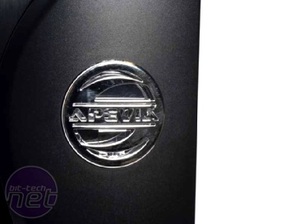
Pushing that aside though, even most of the details of the case managed to raise some eyebrows – for the wrong reasons. The Apevia emblem on the top right of the bezel is particularly loath-worthy; it’s a thin and flimsy piece of too-shiny silver plastic. It gets even worse when you turn the PC on too, when the emblem lights up with a blue LED that, while intended to look ‘cool’, actually only looks garish and cruelly cold.
The buttons for the case are very similar to this emblem as well, hidden though they are behind the incredibly cheap feeling door that feels like it’s made out of spit and sugar. The buttons are made from the same plastic as the Apevia sigil and wobble uncertainly in their housings like bunnies hopped up on caffeine, peering out of their burrows and scouting for predators, though they do at least provide a satisfying click then you press them in.
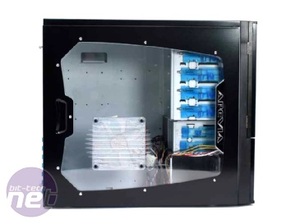
The side of the case has a large plastic window set into it and a 120mm fan (also lit by blue LEDs) but the view is spoiled somewhat by the massive silver, plastic streak that declares the Apevia brand once more on one side of it.
Gee, I wonder if there’s anywhere on the case which isn’t horribly branded with the Apevia logo? Let’s check inside the box and find out.

MSI MPG Velox 100R Chassis Review
October 14 2021 | 15:04


Want to comment? Please log in.