Connect four
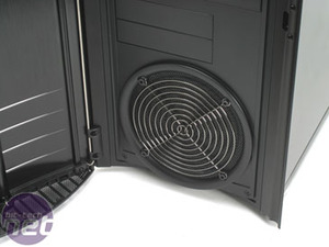
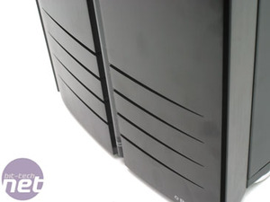
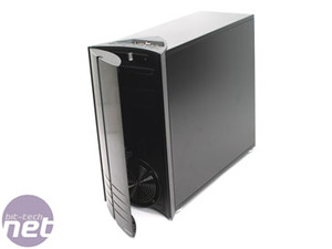
The door itself is attractive though, looking simple and stylish without being contrived. There are four slices in the front, located on the bottom of the door. When the PC is turned on, the fan on the other side of these slices lights up blue with LEDs and the light does look quite pretty as it filters through the holes.But that’s not all.
The front of the case is also illuminated with what I think looks like a lame-ass attempt at a lightsaber – it’s a plastic tube which channels light from a blue LED down it. Although it may feel a bit tacky at first, it does actually look quite nice when turned on and lit up – though whether you leave it on for late night gaming sessions is a matter of personal preference.
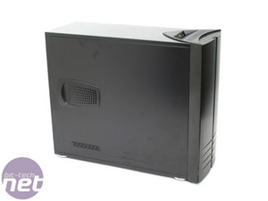
The top of the Rhodium is almost identical to the Zirconium, with the same Revoltec branding recessed forever into the top-front of the case and a cluster of ports on a slant in the top of the case. The connections available are the usual flavours; USB, headphones and microphone, but with the added bonus of an e-SATA connection which is pretty useful.
However, our concerns about the Zirconium’s connection set still hold true with the Rhodium and we reckon that the ports would quickly fill with dust thanks to the little sink they sit in. Again, not a massive flaw and neat-freaks like myself will find it easy to clean out, but it is another thing to bear in mind. Personally, I keep an old make-up brush by my PC at all times to clean out my dust-prone G15, but an occasional vacuum would do the job of cleaning out the ports as well.
In terms of branding the Revoltec label, which is recessed into the top of the case, is as bad as it gets and even that isn’t painted, so it doesn’t exactly stand out. Personally, I’d be tempted to keep spare paper clips (or make-up brushes) in the in the recessed letters. The only other element of branding on the case is on the door, a small silver ‘Revoltec’ label which is painted into the bottom-right corner. It’s small and, in our opinion, actually adds to the design. And because it isn’t engraved at all there are a lot more options for disguising it.
The front of the case, under the door, is a fairly standard design. There’s room for four 5.25” drives and two 3.5” drives, though the 3.5” drive spaces are curiously shifted to the left rather being centrally aligned. It looks a little weird, but I suppose it leaves a perfect space to put a bit-tech case badge.
The bottom of the case features a rather attractive 120mm fan that is hidden behind a silver metal fan cover and a black metal mesh, which sits behind the cover. The overall effect shouldn’t look good, but it comes off surprisingly well and looks a little bit like a subwoofer mounted in the front of the PC case.
There are some things to really dislike about the Rhodium though, namely the power buttons. The power button itself isn’t too much of a problem and it passes the Martin Test with flying colours despite the somewhat tacky feel of the clear plastic. The real issue is with the reset button, which is tiny and recessed into the case so that you’d need a pin to press it at all.
Suddenly my idea of keeping a spare paper clip in the recessed lettering doesn’t seem so stupid, does it?

MSI MPG Velox 100R Chassis Review
October 14 2021 | 15:04


Want to comment? Please log in.