20" widescreen monitor group test
March 30, 2006 | 21:36
Companies: #acer #benq #nec #test #viewsonic

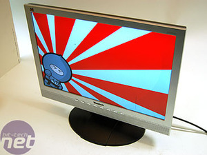
Viewsonic 2012W
Native resolution: 1680x1050Contrast ratio: 600:1
Brightness: 300cd/m2
Response time: 8ms
Price: £329
The Viewsonic 2012W sports the lowest specification of all the products on test here today, but it doesn't quite have the lowest price. With a 600:1 contrast ratio, it doesn't have quite the same range as the others on test here today which sport 800:1.
The hardware
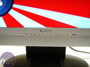
How does the monitor rack up physically?Menu and controls: Viewsonic insists on a uniform menu and button system across all its monitors, but we have to say that we really hate it. None of the buttons are really properly labelled, save for the volume buttons. The menu buttons are labeled '1' and '2' and you have to constantly be looking at the screen to work out which one is doing what at any one time - why not just label them 'Select' and 'Exit', for example? The on-screen menu is, consequently, a nightmare to navigate.
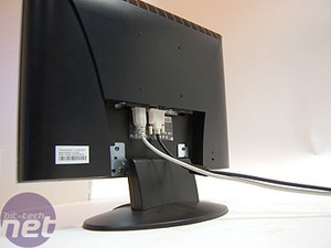
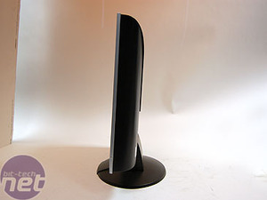
Ergonomics: There is no adjustment of any sort on this display, save for a vertical tilt.
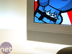
Design: The screen is quite a pleasant design, with a large speaker grill across the bottom of the monitor. There's a relatively large bezel around it which will either appeal to you, or not, depending on your taste.
Screen and viewing angle: The screen appears as bright and clear as any of the others. However, it suffered from a fairly horrendous viewing angle. Whilst it was viewable fairly well along a horizontal plane, moving vertically made the image almost unreadable. This is an unfortunate characteristic in a display that has no vertical adjustment!
Testing
Display Mate: We found that in our Grey Band test, the colours came out with a definite green tinge - a sure sign that the dithering is confusing the monitor. By playing with the colours using the monitor's menu, we were able to get a nice neutral grey - but that mucked up the other colours. We found that colour representation was generally slightly off, with compression at both ends of the scale meaning that shades of grey ran into black and light colours ran into white too easily, making it hard to distinguish between subtle changes of colour.Quake 4: Our game, which started at the beginning and continued throughout the first level, was horrendously black. It was impossible to pick out details in the shadows, which were basically totally blacked out, making the game very difficult to play.
Crouching Tiger: Over saturation was the name of the game here, with colours being far too strong, and the contrast between them sometimes looking rather overexposed. However, we find the blacks a little better here. Overall, this wasn't really a great viewing experience with the movie really being ruined by poor colour representation.
Miami Vice: The same was really true here, with the bright areas of the movie being overly saturated and the blacks being rather bland. Rather than adding character to the picture, the cinematic stylings rather made the picture look awful.
RELATED ARTICLES


MSI MPG Velox 100R Chassis Review
October 14 2021 | 15:04

Want to comment? Please log in.