20" widescreen monitor group test
March 30, 2006 | 21:36
Companies: #acer #benq #nec #test #viewsonic

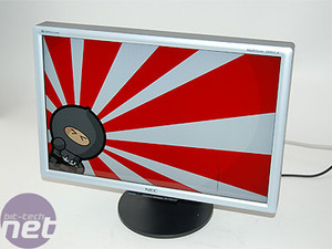
NEC MultiSync 20WGX
Native resolution: 1680x1050Contrast ratio: 800:1
Brightness: 470cd/m2
Response time: 6ms
Price: £423
This is the best specified monitor out of all of those on test here. It has a higher brightness and a faster response time. To be honest, we're not worried about the response time - we couldn't see a difference between 6ms and 8ms in our tests. However, the brightness difference is definitely noticeable.
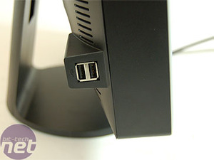
The NEC also has a couple of USB ports on the side for easy connection of iPods, digital cameras or whatnot. It's the only monitor here to do so.
The hardware
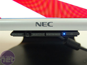
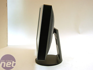
Menu and controls: The menu system is undoubtedly the best of all the displays here. The buttons kind of 'hang' underneath the front bezel, and are clearly labelled. Rather than buttons to navigate around, there's actually a four-way joystick that you can use to move through the menus, and this is intuitive. We loved the fact that not only is there a blue LED next to the power button to signal its status, but you can dynamically alter the brightness of the LED through the menu. Sweet.Ergonomics: The monitor has a tilt, but nothing else. The main body of the display is a little bit chunkier than other models, so you may think this is a little bit more annoying in terms of desk space.
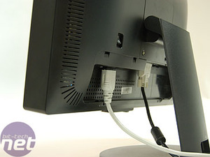
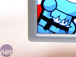
Design: There is a silver bezel which is very curved that runs around the screen. It's not your traditional black square plastic, and we quite like it. However, the back of the panel is very plain and chunky, and doesn't exactly scream high end.
Screen and viewing angle: This is the only screen to have any kind of coating on it. In this case, it sports NEC's Opticlear technology. This is effectively a glossy coating for the screen that gives an added vibrancy to colours, making the screen not only appear brighter, but sort of more 'real'. The major downside to this technology is that, as gorgeous as it makes the screen look, it can be reflective if you're sitting close to the display and looking at a dark picture. This is a problem, as we will explain.
Testing
Display Mate: We thought that the grey band test displayed a little bit of a green twinge at the very dark end, but this was negligable. We found that we were able to configure the monitor to give outstanding differentiation between either blacks or whites, but not both at the same time. By default, the monitor looked fairly average, but a little bit of tweaking pulled a fantastic picture from the monitor - although not at both ends of the contrast scale at once. The white stepping was outstanding, with a very clear line between top-end colours.Quake 4: The Opticlear surface gave very intense, vivid colours - fantastic. However, the major problem we found was that the surface treatment can produce reflections when the displayed colour is black, and Quake 4 is made up of a lot of black. The end result is that you can spend as much time looking at yourself as you can looking at the warfare on screen. The problem does go away if you happen to be gaming in a darkened room, where the display is the only thing illuminating the screen. However, in a normally lit room, the surface can prove as much a hindrance as a help.
Crouching Tiger: This screen provided a really nice picture for our reference DVD. The blacks looked great on this, with the protagonist's robes looking black, not a washed out grey. Colours weren't quite as saturated, and the overall picture was far nicer. However, we did feel like the whites were a little blown out, giving a miniature HDR effect.
Miami Vice: The same was true here. The picture was clear and well-defined with an appropriate colour level and detail coming out as detail, not as awkward grain.

MSI MPG Velox 100R Chassis Review
October 14 2021 | 15:04


Want to comment? Please log in.