20" widescreen monitor group test
March 30, 2006 | 21:36
Companies: #acer #benq #nec #test #viewsonic

Acer 2032WA
Native resolution: 1680x1050Contrast ratio: 800:1
Brightness: 300cd/m2
Response time: 8ms
Price: £411
Despite having the same on-paper specifications as the BenQ and Viewsonic monitors, the performance of the Acer monitor was far closer to that of the NEC. We have already looked at this display, in a different guise, as the Ferrari F20, and we really liked the monitor back then. Are our opinions swayed by the other models on test?
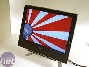
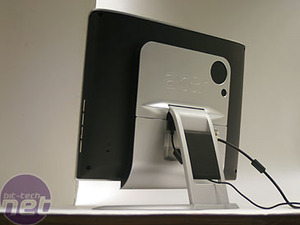
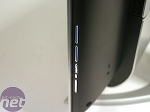
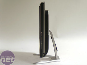
The hardware
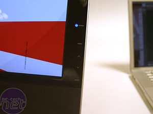
Menu and controls: We've been spoilt rotten by the awesome controls on the NEC, and the Acer holds up better than the Viewsonics, but isn't in the same league on this front. The buttons are on the side of the display, but the labels are on the front, making them easier to use than the BenQ. There's also a dedicated input select button on the bottom.Ergonomics: Again, we have just vertical tilt here. Aren't you bored yet?
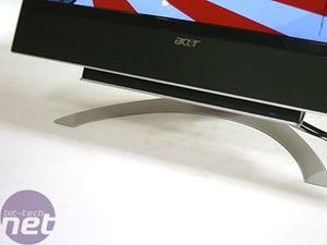
Design: When we looked at this in its Ferrari guise, we really liked the design - the blazing red and black carbon made for a striking colour combination. However, in a standard black and silver, it looks a bit bland and a bit like everything else on the market. It's also really massive compared to other monitors - the bezels are really chunky and the monitor has a much bigger footprint than the others.
Screen and viewing angle: The screen sports a glossy coating very similar to that on the NEC. The corresponding pluses and minuses are here: colours do look more intense and brighter (although less bright, since the NEC is physically brighter) but the reflections in games can be a problem.
Testing
Display Mate: The panel did well in all our tests here, with greys perfect, blacks competent, whites pretty good and the scaling of shading on colours doing well. We actually thought that colour blending and stepping was possibly the best we've seen.Quake 4: This was about the same as the NEC, with colours that were very vivid, although slightly less so than that monitor. We also thought the blacks were good on the outside levels, but then our opinion changed as we moved to the interior of the level, where we thought there was a little bit of detail lacking.
Crouching Tiger: Here, colours were definitely amongst the best, without too much saturation and with pretty decent scaling on darker colours. However, we had to turn the brightness right down to get really decent blacks, and this made the whites slightly less-so in the brighter scenes.
Miami Vice: We found the performance virtually identical to the NEC - we weren't really able to see any differences between the two.

MSI MPG Velox 100R Chassis Review
October 14 2021 | 15:04


Want to comment? Please log in.