Image Testing
Playing with the OSD reveals more Dell-inspired design; it’s controlled via the five touch-sensitive buttons along the lower right of the bezel, and the menu is very similar to that of the excellent Dell SP2309W. As with the Dell, pressing each button produces an annoying bleep, but unlike the Dell, there’s no option to turn this off. Our colleagues threatened violence if we didn’t complete the configuration stage of this review super-quick.Fortunately, there wasn’t much that needed tweaking. To achieve the broadest contrast range, we dropped the contrast to 59 and increased the brightness to 77. This gave the screen a muted and dull look, but it was the best we could manage. Playing with the preset modes gave us no joy, with each profile resulting in horrible colour balances and distorted contrast bias.
With our custom setup, we found that the contrast range was acceptably broad, with excellent definition of dark shades of colours even if the screen wasn’t quite so adept at distinguishing light colours. This should lead to rich and detailed shadows in games and films. The black level was suitably dark, and we saw no distracting light leak around the edges of the screen either.

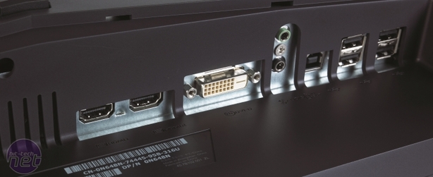
A plethora of inputs (surely you know what a plethora means? Have you not seen The Three Amigos?!) Click to enlarge
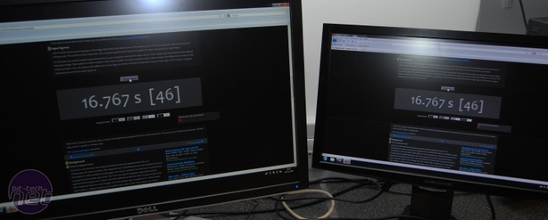
Response times in the Lagom tests showed a tendency towards inverse ghosting, though not to an extreme degree – the quoted 2ms response time seems accurate. We saw some colour distortion in the vertical plane, but never enough to offend, while colours remained solid as we moved our heads from side to side. Input lag was minimal – just a few milliseconds behind the practically lag-free Dell UltraSharp 3008WFP-HC.
The OptX proved to be competent in real-world testing. The 1,920 x 1,080 native resolution helped with the Serenity HD trailer, where we saw clean and strong colours, even if they weren’t particularly punchy or vibrant. Skin tones were natural and the colours were neutral, with no unwanted red, green or blue tint. The lack of vibrancy in Crysis meant that while the jungle looked clean, it lacked depth and impact – it looked as though somebody had vacuumed the island but forgotten to water it.
The ability of the screen to discern details in the shadows helped no end when we played Call of Duty – night scenes were appropriately gloomy, and we could see enemies hiding behind bushes without the need to squint. The lack of vibrancy of the screen helped to enhance the mood of Batman: Arkham Asylum, whereas an eye-popping PVA panel might make colours too vibrant for the brooding madhouse. In Dirt 2, the flashes of colour and sunlight didn’t quite have enough punch. On the desktop, the dullness of the OptX is even more noticeable, with white tending towards grey.
Conclusion
We didn’t look at the panel technology of this screen until we’d finished testing, and were surprised to see it listed as TN; we thought it might be a basic IPS with a very dim backlight, which is pretty high praise. With acceptably high image quality, and the benefits of quick response times and low input lag, you’d think that the OptX would be a winner. However, even with delivery included in the £299 price, it costs too much for 21.5in screen. The NEC MultiSync EA231WMi offers superior image quality, similar stand adjustability and a bigger screen for the same price.- Image Quality
- x
- x
- x
- x
- x
- x
- x
- -
- -
- -
- 7/10
- Features
- x
- x
- x
- x
- x
- x
- x
- x
- x
- -
- 9/10
- Value
- x
- x
- x
- x
- -
- -
- -
- -
- -
- -
- 4/10
- Overall
- x
- x
- x
- x
- x
- x
- -
- -
- -
- -
- 6/10

MSI MPG Velox 100R Chassis Review
October 14 2021 | 15:04


Want to comment? Please log in.