Objective Image Quality Analysis
There is a wide range of image quality testing applications and resources available today. One of our current favourites can be found over at Lagom. Detailed tests for everything from colour gradients to gamma calibration and pixel response are included along with a detailed guide to interpreting what you are seeing.Before we got onto working our way through our test images, we immediately realised that the default image quality out of the box was frankly pretty awful. Text was over-sharpened and colours looked over saturated – all in all, what we were greeted with didn’t look particularly promising but then we weren’t expecting a lot from the VK222H’s TN+Film panel.
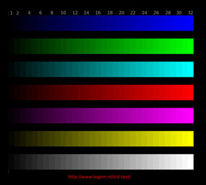
Quickly running through some of our tests confirmed that the display’s image quality was more than a little suspect. In the Lagom contrast test, for example, there was a massive amount of compression at the top end of the colour scales. The Blue and Red bars were hit the hardest, with no differentiation between the colour scales right down to bar “25” at the lighter end of the scale and it was difficult to distinguish bar “2” at the darker end – that’s a pretty horrendous result whichever way you look at it.
At this point, we flicked through the various “Splendid” options to see how they effected what we were witnessing in the contrast test. Frankly, all of the presets were rubbish and all evidence was pointing to the VK222H being quite a lot more than a bit of a stinker – in fact, there are much harsher words I could use, but the display started to redeem itself when I started manually tweaking the various settings available in the clunky OSD.
Following several hours of tweaking, looking at various test images (both synthetic and real-world), high-definition videos and also playing some games, we managed to get something that looked respectable but by no means great. If we had to choose one word to describe the VK222H’s image quality, it would be sludgy.
The aforementioned colour scales contrast test was acceptable, with all of the 32 colour bars visible and distinguishable; what it lacked though was vibrancy – the colours looked dull and washed out. It’s therefore a tossup between vibrancy and compression – you can’t have both and that’s a bit of a letdown.
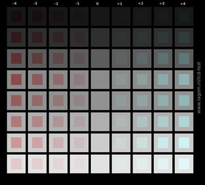
Black levels were OK, but nothing special – we were able to distinguish between levels four and five, but the squares labelled one, two and three were not visible above the black background. The white test faired a little better – we were just about able to make out level 253, but not level 254. The gradient tests weren’t bad either, but there was evidence of some slight banding in the darker greys and a subtle pinkish tinge in the mid-tones.
The horizontal viewing angles aren’t too bad for a TN panel, but they’re not going to come close to any display with superior panel technology at the heart – there was evidence of colour inversion at around 165 to 170 degrees and text wasn’t easily readable at even more obtuse angles. Where the VK222H’s wheels really started to come off though was when we started to test the display’s vertical viewing angles.
Even just messing with the display’s tilt functionality was enough for us to witness some severe colour inversion in certain scenarios. One example of this was with a solid red background – at the top of the panel, it looked like a fairly deep red but it quickly faded to a pinkish-red by the time it reached the bottom. Tilting the panel either improved or worsened the situation but at best it wasn’t great and at worst it was awful.
Finally, pixel response was as good as you’d expect from a 2ms TN+Film panel – it was quick but that wasn’t unexpected. Let’s see how all of this translates into some real-world scenarios...

MSI MPG Velox 100R Chassis Review
October 14 2021 | 15:04


Want to comment? Please log in.