Testing:
The PG221 features quite a large selection of colour configurations and modes that fall under Asus’ “Splendid” colour optimisation technology. There is standard, theatre, game, night view and scenery modes. These are said to enhance colours and deliver a more vibrant image in the various scenarios they’re designed for.However, having used the presets, we actually preferred to just tweak the standard mode to get the best looking image on screen. In addition to these options, Asus includes four preset colour temperature settings (cool, normal, warm, sRGB) and also a user-configurable mode too, giving you plenty of ways to optimise the screen’s colour reproduction.
If that wasn’t enough, there is also the option to tweak skin tones with three different options (reddish, natural, yellowish) although I’m not sure why you would want to make everyone look either “reddish” or “yellowish”. There are also sharpness, saturation and the ASCR option available too – the latter is Asus’ Smart Contrast Ratio technology.
Having said that, if you opt for the “standard” Splendid mode and tweak the settings yourself, these options are not available for you to adjust.
DisplayMate:
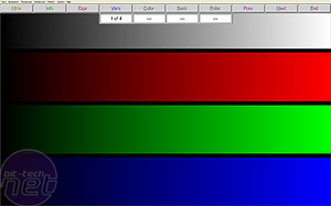
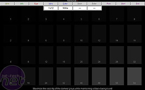
Using the various preset modes, we found flaws in more than one of DisplayMate’s tests. In particular, the night view mode suffered under the 256-intensity level colour ramp test and had poor colours at the darker end of the scale. Green was the worst by far, and actually looked slightly purple. We also saw signs of compression at the lighter ends of the 64-step gray scale test too. Game mode showed signs of compression in the lighter blues and greens under the colour scales test and showed a pinkish tinge in the 64-step 4 symmetric gray scale test.Scenery mode was the opposite of night view mode, in that it darkened everything rather than lightening everything slightly. We noticed some slight banding in the greens on the 256-intensity colour ramp test and we also still had compression in the blues in the colour scales test with this mode. Theater mode also suffered from similar banding problems in the 256-intensity colour ramp test, and there was still a slight but noticeable pink tinge to the 64-step 4 symmetric gray scale test.


Finally, after some tweaking using the standard mode and the sRGB colour preset, we managed to get some pretty good image quality from the screen. The 64-step 4 symmetric gray scale test showed a pretty decent result, although there was a slight hint of green – nothing to really be concerned about though. Banding in the 256-intensity level colour ramp was respectable but still apparent in the darker end of the greens. We also managed to get rid of the compression in the colour scales test too with an overall pretty good showing here.
High-Definition Playback:
For this test, we used a selection of 1080p and 720p movie trailers downloaded from Apple’s movie trailer page. Interestingly, the PG221 supports 1980x1080 over DVI, but having played around with it, it’s not a resolution we’d recommend using. Understandably, it looks rather squashed and 1080p content actually looks better scaled down to fit the screen’s native 1680-pixel width.With the PG221 set to its native resolution, movie playback was suitably crisp and clear – the speakers weren’t that bad, either. Enabling SRS resulted in good, but not great, surround sound that came at the expense of accuracy and crispness. Having said that, these are probably the best built in monitor speakers we’ve used to date.
On the settings front, we tested Theater mode and it wasn’t too bad – it gave a sharp, crisp and vibrant picture but this came at the expense of some detail. We found that we were better tweaking the screen ourselves instead of using the built in preset mode.
Gaming:
You could certainly argue that the tests above aren’t really important considering the fact that Asus is pushing this monitor primarily as a gaming monitor. It was a similar story with the gaming preset mode and in Trackmania United, we found the colours were skewed in a rather horrible way – the blue-grey colours that made up the track were washed out, the greens looked a little too electric for our liking and the reds were glowing like one giant beacon. Overall it wasn’t too good, then.

Things changed when we went back to our tweaked “standard mode” settings and the colours were dished out in more measured doses. The game no longer looked washed out and overly vibrant for the sake of being vibrant. In fact, we were very pleased with the way it performed. To add to this, Asus’ quoted 2ms grey-to-grey response time meant that there was no visible ghosting present in this rather fast-moving title but in my experience a screen with response time lower than 16ms isn’t going to suffer from ghosting.
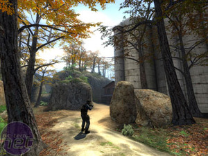
I also fired up Counter-Strike: Source and played through the Militia and Prodigy maps as in my opinion these are two of the best-looking maps in the game. It was a similar story with the gaming preset – the colours just looked wrong and the story was similar to what we saw in Trackmania United. The combination of sRGB and tweaking brightness and contrast settings gave the best results again.
With the lights on, the high-contrast screen coating acted more like a mirror in the dark areas of Militia. However, once we had turned the lights off, the blacks were pretty good and you could pick out details in the dark areas.

MSI MPG Velox 100R Chassis Review
October 14 2021 | 15:04


Want to comment? Please log in.