
Faster is better
Last month we took a look at a 19" Viewsonic panel that we really liked and said it was a good gaming monitor. However, there is far more to being great for gaming than just a fast response time - it's also important to have a good colour representation, black differential and viewing angle.This BenQ model is 17" and runs at 1280x1024. 17" is an incredibly popular size for a TFT monitor, since the price / size ratio is just about at a sweet spot. However, with 17" panels available for as little as £140 / $250, what do BenQ believe sets them apart?


Design
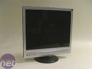
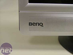
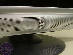
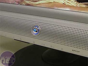
As for looks, we have to say that the monitor is nothing special. The silver bezel is nice, but it's not really cutting edge design - there are far nicer monitors available out there if you're after eye candy, such as the aforementioned Formac Gallery displays (although we do like the blue power button that lights up when the monitor is on). The base is kind of... bland. The circular black base doesn't fit with the very square, silver frame of the monitor.Controls
The menu system is a bit of a nightmare. It's rather counter intuitive - it's almost impossible to use without consulting the manual, because the buttons all appear to have multiple functions. Whilst easier panels simply have a menu button and some arrow keys, the BenQ attempts to map common functions to hard buttons, which should make things faster. However, we spent ages playing with the settings just to try to work out what the buttons all did. There's plenty of room for adjustment, but be prepared to spend a good few minutes working out how to make it!
MSI MPG Velox 100R Chassis Review
October 14 2021 | 15:04


Want to comment? Please log in.