ASUS Eee Keyboard PC Software
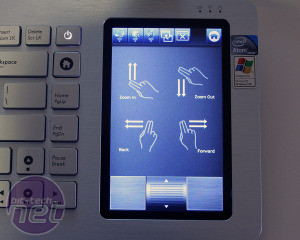
Starting off with the software and usability first, because arguably that's most important, it's now weird to see the underlying Windows XP Home Edition OS - it's a consequence of its long period in development. Asus claimed in our recent interview that it would take too long to port the specially designed UI to Windows 7.Asus bundles in Arcsoft's Media Player that it ties in directly to its UI. Hit the 'video' button in the TV tab and Arcsoft loads while the touchscreen automatically changes to represent a remote control - nice! Annoyingly though things such as fullscreen still require the mouse curser, but that's also a click away using the button at the top. Given the limitations out output resolution, it'll play video up to 720p HD resolution and the video acceleration option that works with the Broadcom chipset is automatically selected.
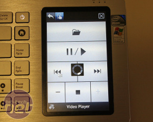
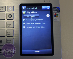
The remote control designed for Arcsoft's media player. Frustratingly, whenever we wanted to open a video it would ALWAYS revert back to the "My Videos" directory. Who actually uses that?
We tried several videos to see what the hardware could handle and found that up to DVD resolution it worked fine with both DivX and h.264, in avi, mov and mkv file containers, however the upscaling to 720p resolutions was atrocious. The often large and blocky pixels were clear to see but varied between the videos we tried, however the sharpness and overall quality was generally lacking.
Trying 720p media and some ran smoothly, but not everything - some played, while other higher bitrate media stuttered under the strain of CPU. This could be because of the way the clips were encoded and the Broadcom chip might not accelerate every level of h.264, admittedly we're not quite sure.
We found YouTube stuff plays fine, along as you keep to 480p: anything HD isn't accelerated and therefore again too much for the Atom cores to handle.
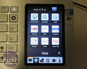
We like the simple and clear graphical buttons that link directly to things we'd actually use - Facebook, GMail, YouTube, MSN, Skype etc, but we've been spoilt by layout customisation from smartphones - here everything is fixed.
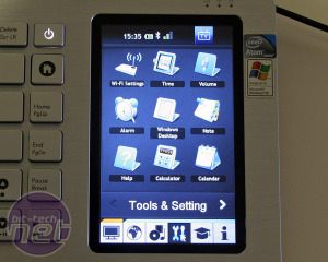
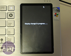
The "Display Change in Progress" occurs when the remote display is initiated or a program is launched via the Keyboard shortcuts, and takes a few seconds.
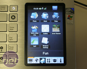
To a point then the UI is clear and it works, but when the Eee Keyboard is really used the intuitive design falls apart. For example, the 'TV & Monitor' tab has the same icons for videos, YouTube, Gmail etc as the 'Web' and 'Fun' tabs, however it's only pressing them on the TV tab gets them to open on the remote display (the TV), while the other tabs open them on the keyboard screen itself. I found myself continually just looked for the "video" icon rather than first navigating to the correct tab, and then selecting what I wanted because as a common computing function we're familiar with a single icon.
It makes me wonder if it would be simpler to have just one set of icons and inject the command 'if TV is not detected, open on the small screen'? Or, better yet, not have the small screen option at all? If Asus had designed the Eee Keyboard so the touchscreen is only an extension of the interface - because that's actually what we expected originally - it would be more logical to use and probably easier to sell.
It's evident that Asus' UI team has tried extremely hard to shoehorn a touchscreen orientated OS overly on top of Windows XP. And really, well done to them for trying because it works excellently. Its downfall comes from the fact Asus has tried to make it do too much, and that it runs on a basic Intel Atom with resource heavy Microsoft OS. This is not a bespoke, low power OS designed from the ground up for touchscreens, and as soon as you step outside the basic functions it shows.
That's not necessarily Asus' fault as back in 2008 people were just getting used to netbooks - apart from Apple, no-one was thinking much about smartphones, let alone tablets. The Eee Keyboard is a victim of the environment and Asus needed some Eee family planning advice because it was conceived before the time was right. If the Eee division had waited and throw in a fast ARM chip such as Nvidia's Tegra 2, then put all that UI effort had been put into coding a versatile multimedia app for Android: the Eee Keyboard could have been mind-blowingly fantastic.
Asus told us that they have re-thought and re-designed the keyboard to simplify it and fundamentally it is simpler, but it's not gone far enough. It's still too trying to do too much.

MSI MPG Velox 100R Chassis Review
October 14 2021 | 15:04



Want to comment? Please log in.