With Satya Nadella having recently been appointed as the new CEO of Microsoft, there will no doubt be many people pointing out all the challenges he and the company has to face. There's the still sluggish growth in its Windows Phone and tablet offerings, the slow uptake and generally negative response to Windows 8, the ever growing presence of Google when it comes to web services and much more besides. Well, rather than offer any solutions - sorry Satya - I'd like to add one more task to that To Do list and it's to sort out the awful UI that is the Ribbon menu.
Now don’t get me wrong, the principle behind the Ribbon is sound; it’s supposed to bring to the fore the most used menu/toolbar items in a more logical fashion, saving the user having to drill down into lots of menus all the time. In developing the interface Microsoft put a lot of time and effort into finding out which menu items were the most used and sought to ensure they were put in more obvious places.

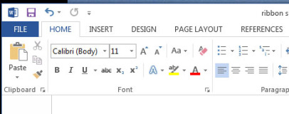
The ribbon menu in Word 2013
Where the old layout required multiple toolbars to be added to the menu to provide quick access to a variety of tools, with Ribbon a whole range of tools from those different toolbars are presented in one strip.
A particularly good example of how Ribbon has improved the experience in some programs can be highlighted by the below video where Alex Simons, Director of Program Management for Windows and Windows Live, introduces the changes to Windows Explorer in Windows 8. The changes are profound and a huge improvement over the Explorer in Windows 7 with far quicker and easier access to common functions, and it has a much cleaner layout (the explorer in Windows 7 is so poor this is hardly a challenge!).
Microsoft has also sought to improve keyboard shortcut access by making every menu item navigable by keyboard. Simply press Alt then work through pressing the key combination for the tab then the menu item you require. Each required key combination is clearly shown as you go along and it’s a simple and consistent process. For instance, in Word, to turn on Bold you type Alt > H > 1 or to save the current theme you can type Alt > G > TH > A.
So, with all those improvements, what’s the problem? Well, while Ribbon has motivated many positive changes to the overall layout of icon-based tools in Microsoft products, it has also introduced its own set of complications and downright ignored some basic design principles.

Keyboard shortcuts aid accessibility but not speed
Starting with those keyboard shortcuts, you may have already seen the glaring issue therein, which is that they’re hardly short shortcuts. The idea that you would memorise and then be able to type Alt > G > TH > A or even Alt > H > 1 quicker than just using your mouse seems highly unlikely. Shortcuts for simple tasks are supposed to provide a way of performing that task more quickly than using a mouse. If you’re invoking a more complicated macro then fine the shortcut can be a bit more convoluted, but for simply opening a menu item or turning on Bold? Not so much.
Now of course keyboard shortcuts aren’t necessarily just about providing speed for advanced users but providing access for those users that may not be able to use a mouse. In this instance the addition is of course a very welcome one, though I’d counter that it hardly needed a change from a more conventional menu system to provide this – the exact same system could be applied to drop down text menus.
Now don’t get me wrong, the principle behind the Ribbon is sound; it’s supposed to bring to the fore the most used menu/toolbar items in a more logical fashion, saving the user having to drill down into lots of menus all the time. In developing the interface Microsoft put a lot of time and effort into finding out which menu items were the most used and sought to ensure they were put in more obvious places.

The ribbon menu in Word 2013
Where the old layout required multiple toolbars to be added to the menu to provide quick access to a variety of tools, with Ribbon a whole range of tools from those different toolbars are presented in one strip.
A particularly good example of how Ribbon has improved the experience in some programs can be highlighted by the below video where Alex Simons, Director of Program Management for Windows and Windows Live, introduces the changes to Windows Explorer in Windows 8. The changes are profound and a huge improvement over the Explorer in Windows 7 with far quicker and easier access to common functions, and it has a much cleaner layout (the explorer in Windows 7 is so poor this is hardly a challenge!).
Microsoft has also sought to improve keyboard shortcut access by making every menu item navigable by keyboard. Simply press Alt then work through pressing the key combination for the tab then the menu item you require. Each required key combination is clearly shown as you go along and it’s a simple and consistent process. For instance, in Word, to turn on Bold you type Alt > H > 1 or to save the current theme you can type Alt > G > TH > A.
So, with all those improvements, what’s the problem? Well, while Ribbon has motivated many positive changes to the overall layout of icon-based tools in Microsoft products, it has also introduced its own set of complications and downright ignored some basic design principles.

Keyboard shortcuts aid accessibility but not speed
Starting with those keyboard shortcuts, you may have already seen the glaring issue therein, which is that they’re hardly short shortcuts. The idea that you would memorise and then be able to type Alt > G > TH > A or even Alt > H > 1 quicker than just using your mouse seems highly unlikely. Shortcuts for simple tasks are supposed to provide a way of performing that task more quickly than using a mouse. If you’re invoking a more complicated macro then fine the shortcut can be a bit more convoluted, but for simply opening a menu item or turning on Bold? Not so much.
Now of course keyboard shortcuts aren’t necessarily just about providing speed for advanced users but providing access for those users that may not be able to use a mouse. In this instance the addition is of course a very welcome one, though I’d counter that it hardly needed a change from a more conventional menu system to provide this – the exact same system could be applied to drop down text menus.

MSI MPG Velox 100R Chassis Review
October 14 2021 | 15:04


Want to comment? Please log in.