Design
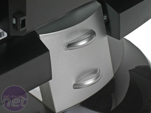
In design, ViewSonic has some history of innovation, as it has demonstrated with its range of ViewDock monitors which incorporate iPod docks.Indeed, though the VX doesn't have an iPod dock, the legacy of the design is still present with the silver central section of the stand. To be frank, this is one of the few aspects of the ViewSonic that looks and feels cheap, which is a shame.
Otherwise, the VX2435wm is a decent, though not stunning, looking monitor. The majority of the display is finished in a glossy piano black, which is okay though it doesn't come close to the quality of finish found on the Samsung SyncMaster 226BW.
If anything, it seems as though ViewSonic is desperately trying to make it look stylish without ever doing anything to deserve such an accolade.
ViewSonic often fits superior in-built speakers compared to its competitors, and the VX2435wm is no exception. That said, that doesn't make them anything special and though they produce good dialogue, anything more demanding is best avoided.
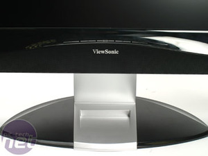
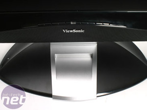
Useful storage area or noticeable reminder that the VX2435wm lacks the iPod dock? You decide
On the back things really take a turn for the unusual. Whereas the great majority of monitors simply group all the connections horizontally along the back, on the VX2435wm they are grouped vertically either side of the connection housing, which is then covered by a massive plastic backing. The way the connections are arranged makes it possible to feed the cables down easily into the cable tidies on the back of the stand, which is great if you like to keep things neat.
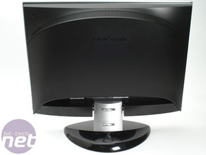
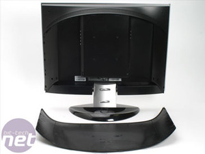
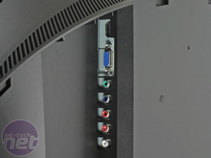
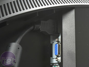
But, there are problems. First, the HDMI port has been placed right in a corner and can be real pain to access. Also, the back panel is exceedingly large, and is awkward to remove. I found subtlety was to be avoided, and giving it a good yank normally provided the desired results. Still, some kind of less violent mechanism would be desirable and would make the whole process of accessing the connections a good deal easier.
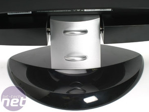
The most disappointing aspect of the design, however, is that lack of adjustability. Whereas competitors such as the Dell Ultrasharp 2407WFP feature the whole gamut of rotate, pivot, height and tilt; the VX2435wm only has tilt. For me, this is a real problem especially considering the Dell is now available at almost the exact same price and also has USB ports and a 9-in-2 card reader. Arguably the Dell is also slightly better looking, benefiting from a simpler, less fussy design. In any case at this price the Dell is the natural competitor to this ViewSonic, and in adjustability and features it trumps ViewSonic's effort.

MSI MPG Velox 100R Chassis Review
October 14 2021 | 15:04




Want to comment? Please log in.