Navigation and Virtual Folders
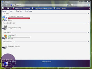
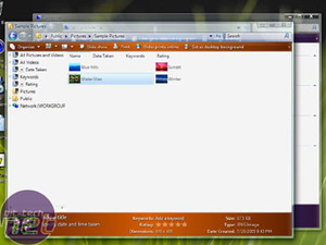
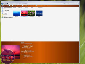
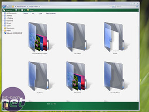
The most obvious change from a user perspective is the new appearance of Explorer windows, which have yet again been designed for the home user in mind. My first impression of navigating the system was that getting to grips with its simplistic, but arguably helpful, interface would not be too difficult.You have the option of adding ratings, authors and keywords to any file (as opposed to the option of doing so mainly to music files through Windows Media Player) in order to make them searchable through the improved search function or Virtual Folders. Virtual folders appear like normal folders, but they're actually more like saved search queries. For example, you might have a Virtual Folder on your desktop called 'Today', which is defined by the query 'All files I've opened Today'. When you click the Virtual Folder, that's exactly what you'll get inside - regardless of the actual physical location of the files within your existing directory tree.
As the file searching function has been suitably streamlined within Vista, these kind of operations are done exceedingly quickly.
In the above image you can also see the "live icons" within Virtual Folders. This is a concept which was applied initially (and simply) to folders in Windows XP, but now follows through to every folder and file. These show realtime the contents of the folder or file and are resizable to suit how you want to handle your desktop. Given that the thumbnail view in Windows XP is not conducive to showing you the snapshot of images inside, the large icon view in Vista makes determining the contents much clearer via a quick glance. It's not going to be for everyone, however I'm sure it's functionality people will appreciate.

MSI MPG Velox 100R Chassis Review
October 14 2021 | 15:04


Want to comment? Please log in.