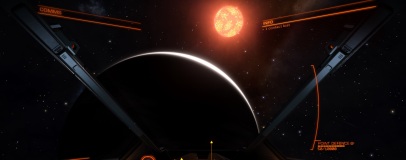
Elite Dangerous Review
Price: 39.99Developer: Frontier Developments
Publisher: Frontier Developments
Platform: PC
It's odd to think that eighteen months ago Elite Dangerous was largely viewed with suspicion. After years of fruitless speculation regarding a potential fourth Elite game, Frontier's £1.5 million Kickstarter appeared to bank on little more than nostalgia, leaving many people, myself included, more than a little sceptical of Frontier's ability to produce such an ambitious game.
This past year, Frontier have proved both the validity of their funding drive and their commitment to the project. They've hit every release deadline they've set themselves, and delivered on (almost) every pledge made in that original Kickstarter proposal. In the space of twelve months I've watched the game grow from a simple combat demo through to an explorable galaxy featuring 100 billion star systems. The development of Elite Dangerous has been a remarkable process to witness. Ultimately though, everything comes down to one question; is the resulting game any good?
The short answer is yes. The slightly longer answer is oh bloody hell it's brilliant. A brief word of caution before we begin, however. Frontier's reasoning behind the Kickstarter was to create a vision that was uncompromised by the involvement of publishers, and that they certainly have done. But as a game it is also quite uncompromising. Space is the harshest of environments, where obliteration is just a few inches of metal away, and Frontier have refused to shy away from that fact. Elite Dangerous is a vast, complex game that gives little in the way of initial direction, expecting the player to learn from experience and experimentation. And death. Sudden, dramatic, frequently embarrassing death.
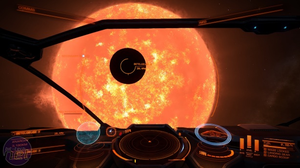
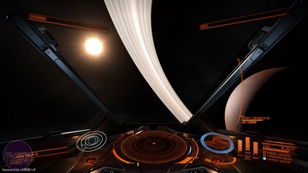
This is a caution rather than a criticism because Dangerous' lack of compromise is vital to its nature, and it gives so much more than it takes away. The scale of the game is the most obvious example of this. 100 billion star systems is an insane number. But it's visible in almost every facet of the design. Take the aesthetics. Each star system is Elite is realistically structured and mapped to scale. There's a blazing star in the centre orbited by planets, asteroids moons, and space stations, with abyssal gaps of inky, star-pocked void between them. This means often there isn't much to look at on the screen but a few pinpricks of light.
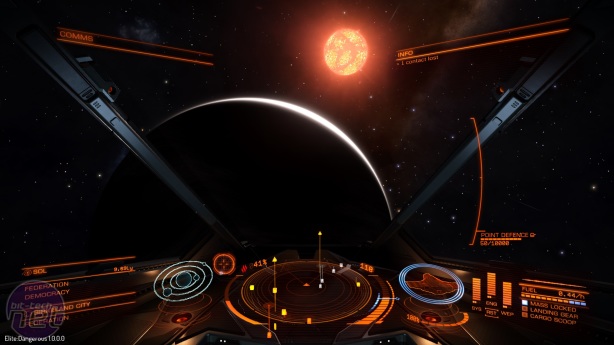
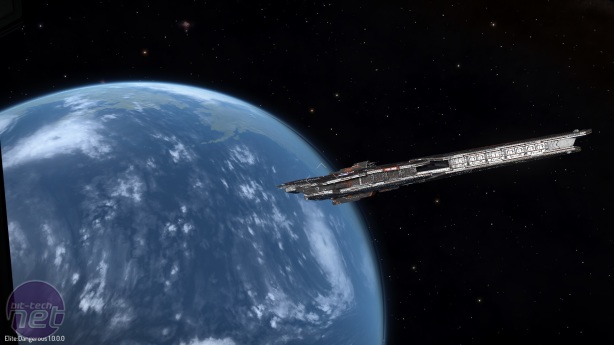
In an age where every other game wants to cram a million different objects on the screen, Elite's authentic representation of the sheer emptiness of space has a powerful effect. Yet Elite Dangerous does have something to show you, by golly it makes the most of the opportunity. Whether it's the blue tint of a passing ship's thrusters illuminating the infinite night, or the light of the local sun creeping over the rim of an eclipsing planet, Elite Dangerous is an absolutely beautiful game, and it that lets you savour that beauty, rather than assaulting your eyes with it.
Even more important is how it feels to play. However you choose to play Elite Dangerous, whether you opt to hunt down space pirates, become an interstellar trader, or try to build reputation with one of the game's three major factions, everything is experienced from the perspective of your ship's cockpit. It's also how Frontier have designed these ships that ties the whole game together, that makes it work.
Although the game is experienced entirely from the first person, Elite's ships aren't represented by a flat HUD or a series of unconnected icons. Instead the ships' cockpits are rendered in full 3D, with important readouts housed on the dashboard in front of you. On your left and right are the navigation and ship computers, their holographic screens activated by free-looking at them. If you glance down you can even see your own virtual body working the ship's controls.

MSI MPG Velox 100R Chassis Review
October 14 2021 | 15:04





Want to comment? Please log in.